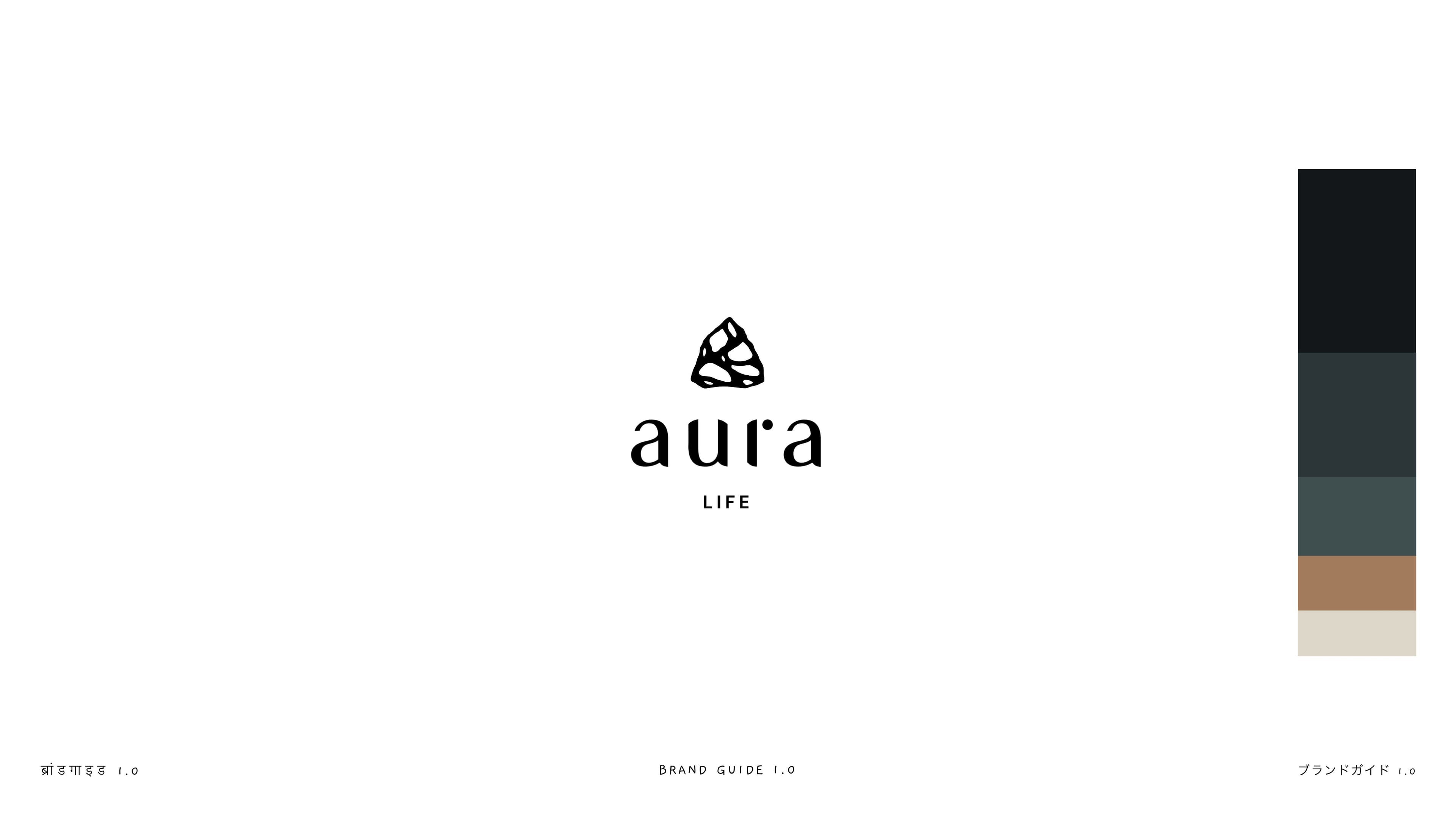
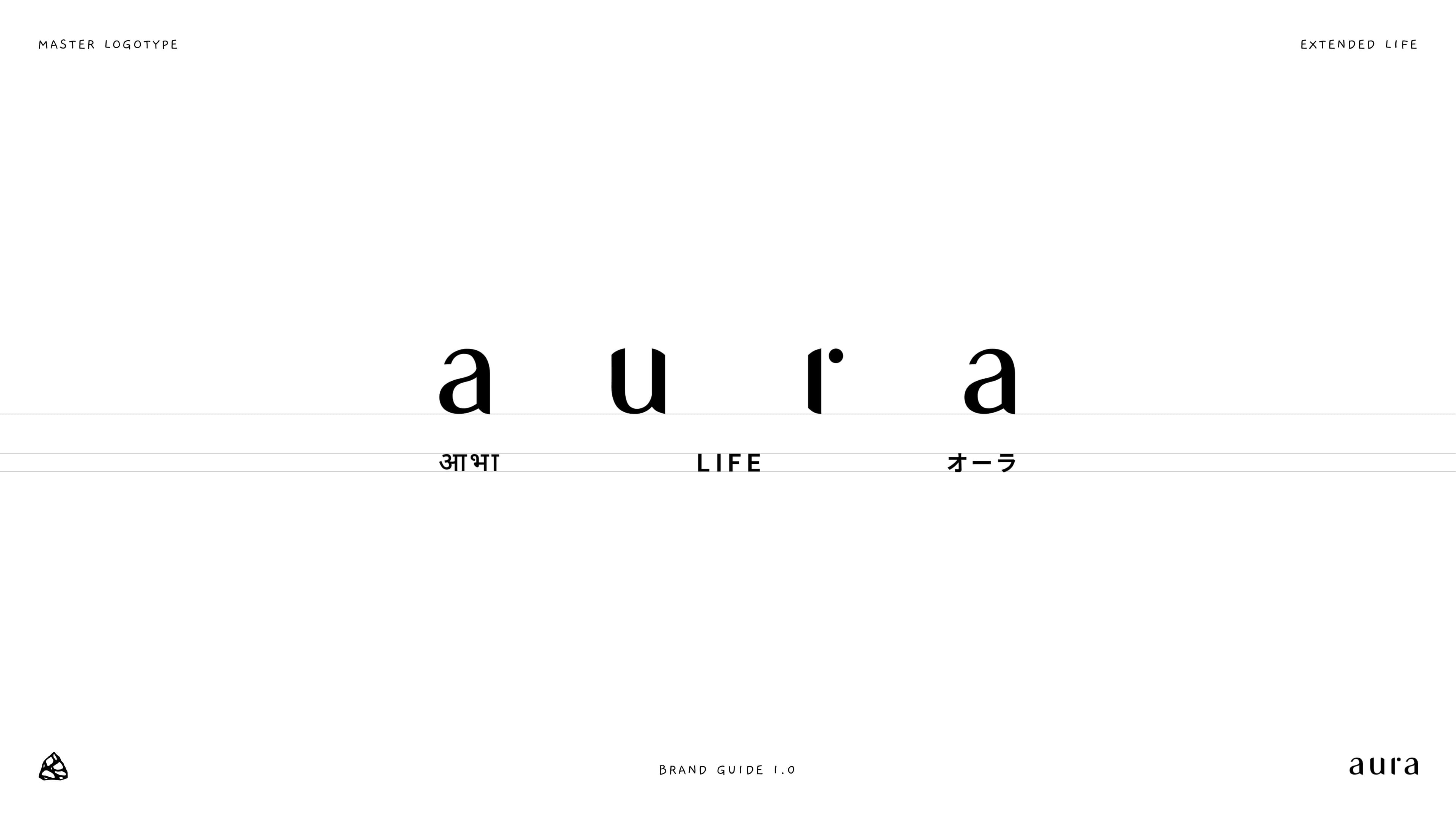
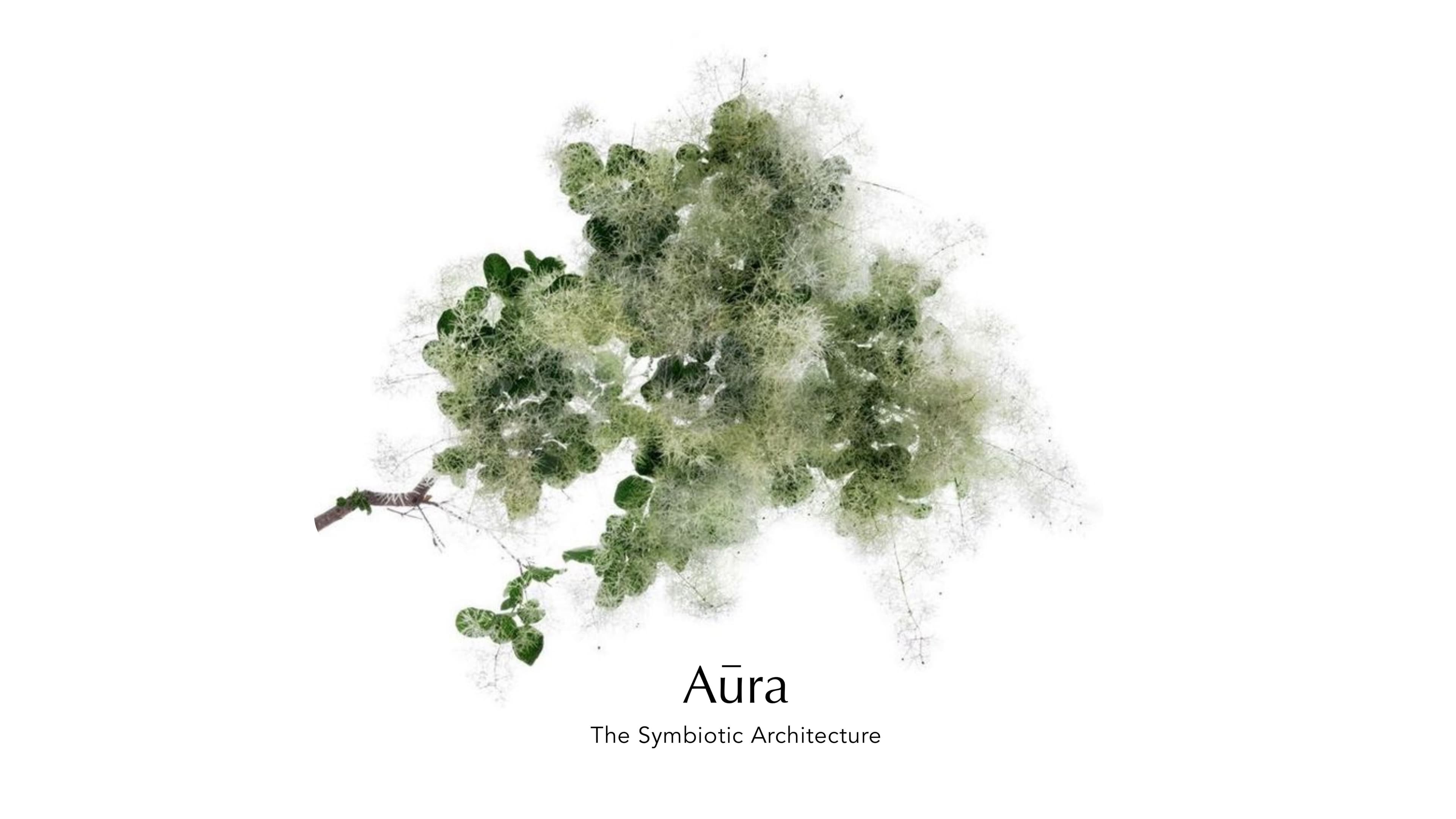
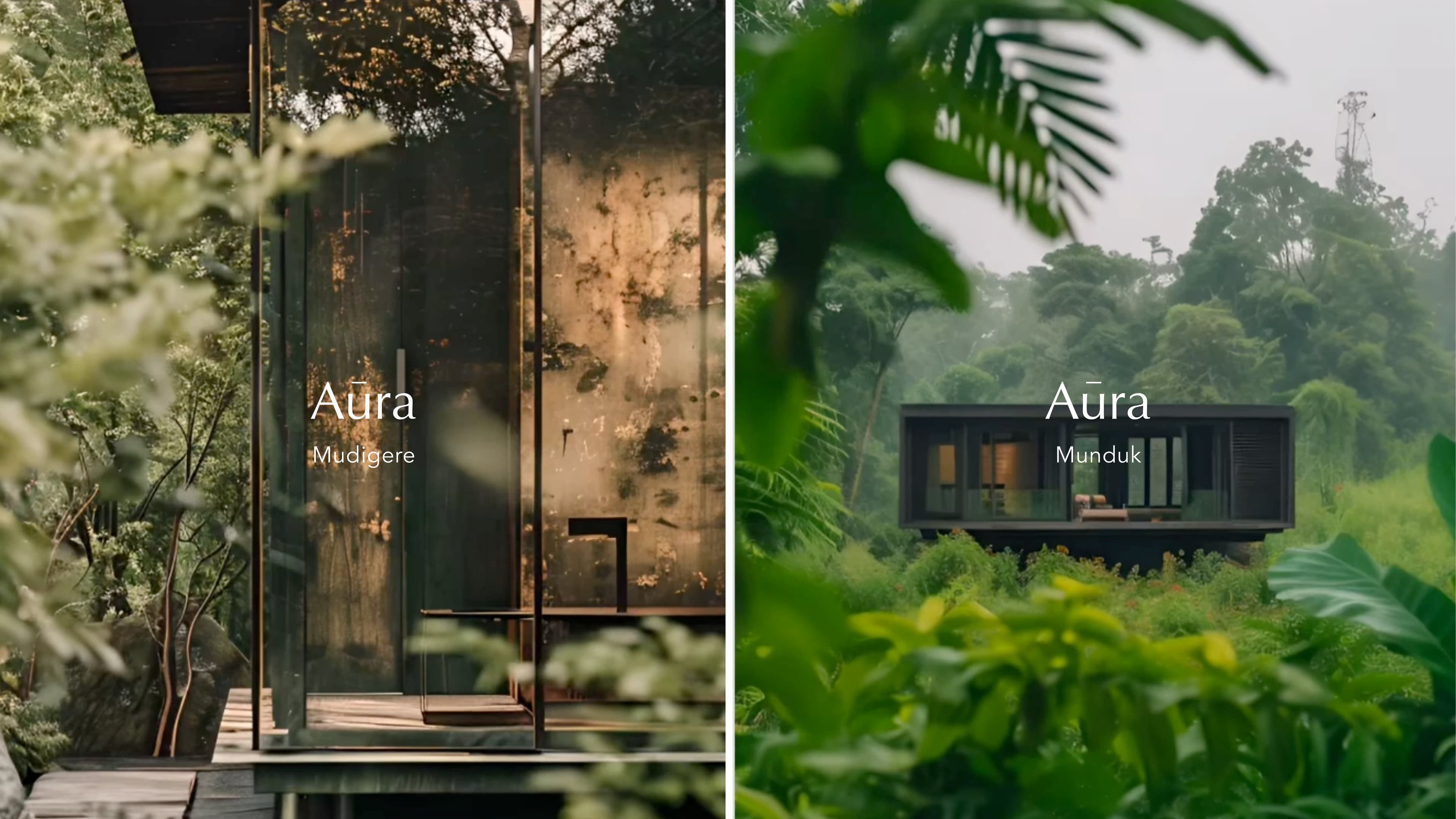
Brand
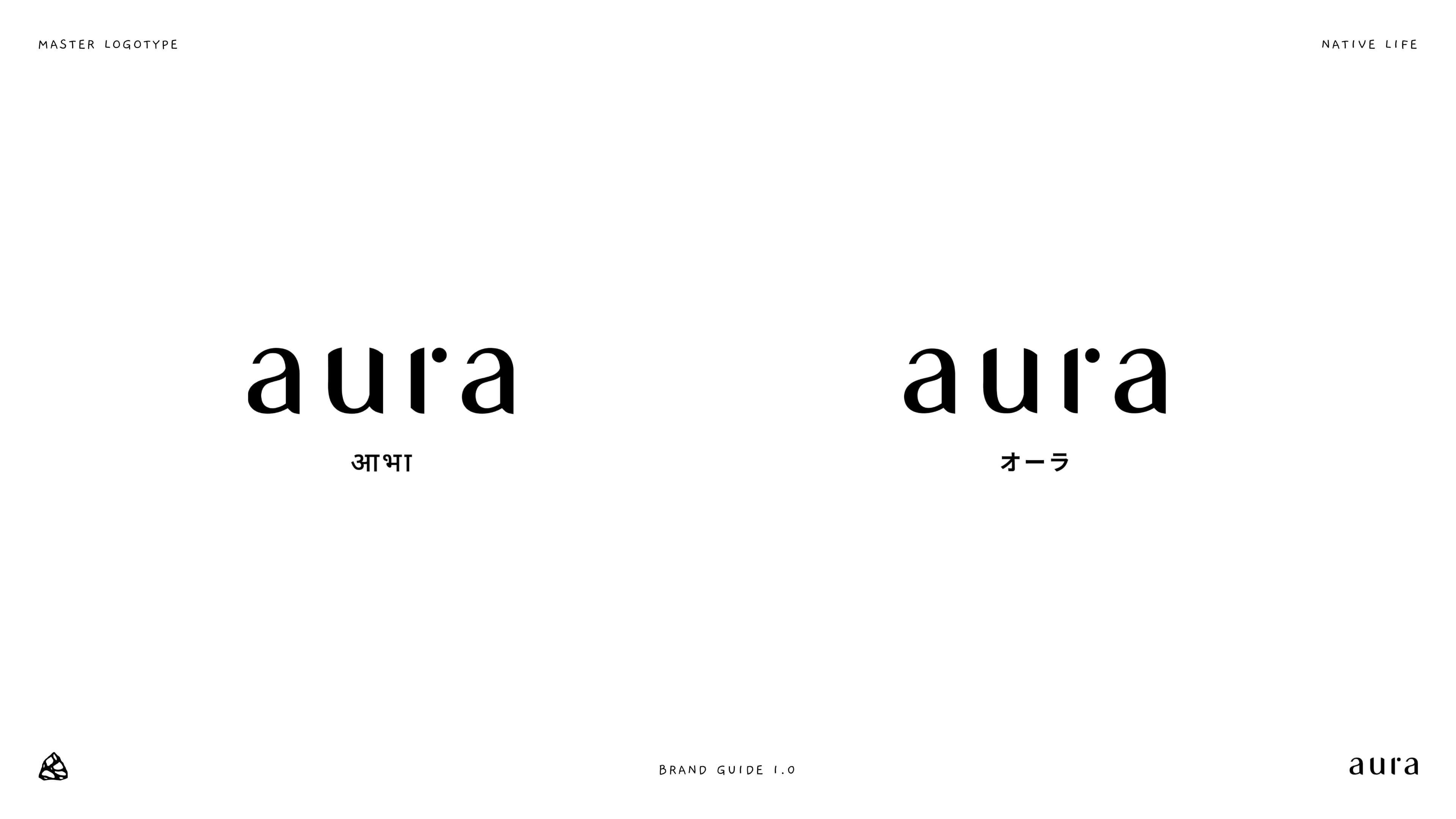
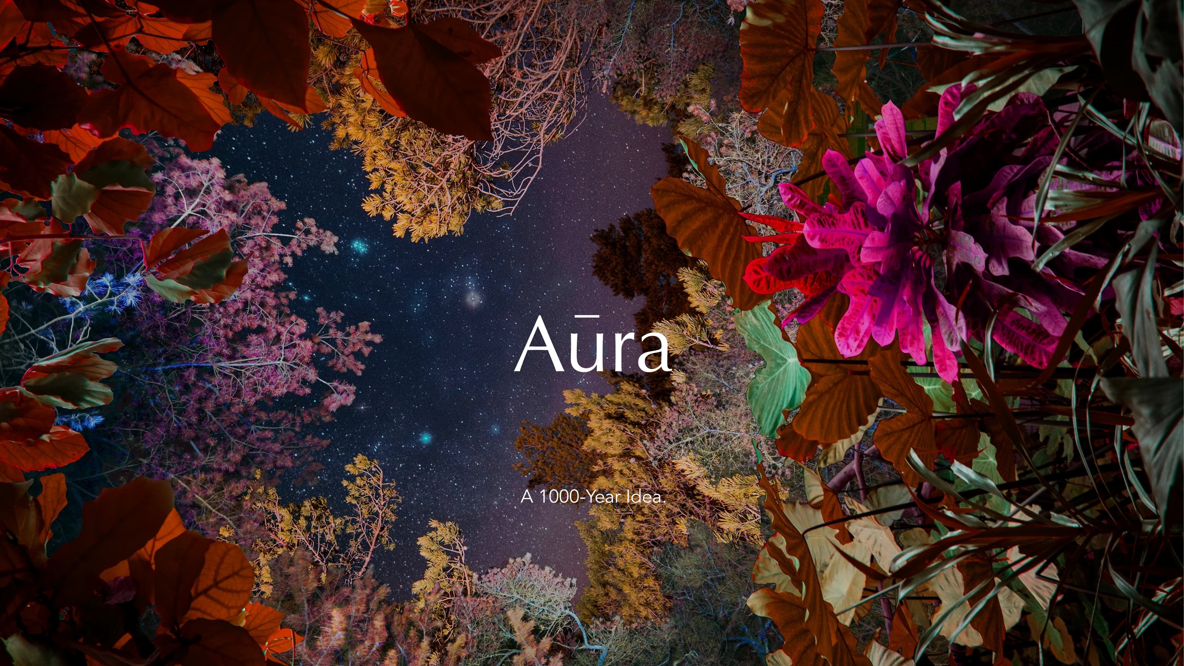
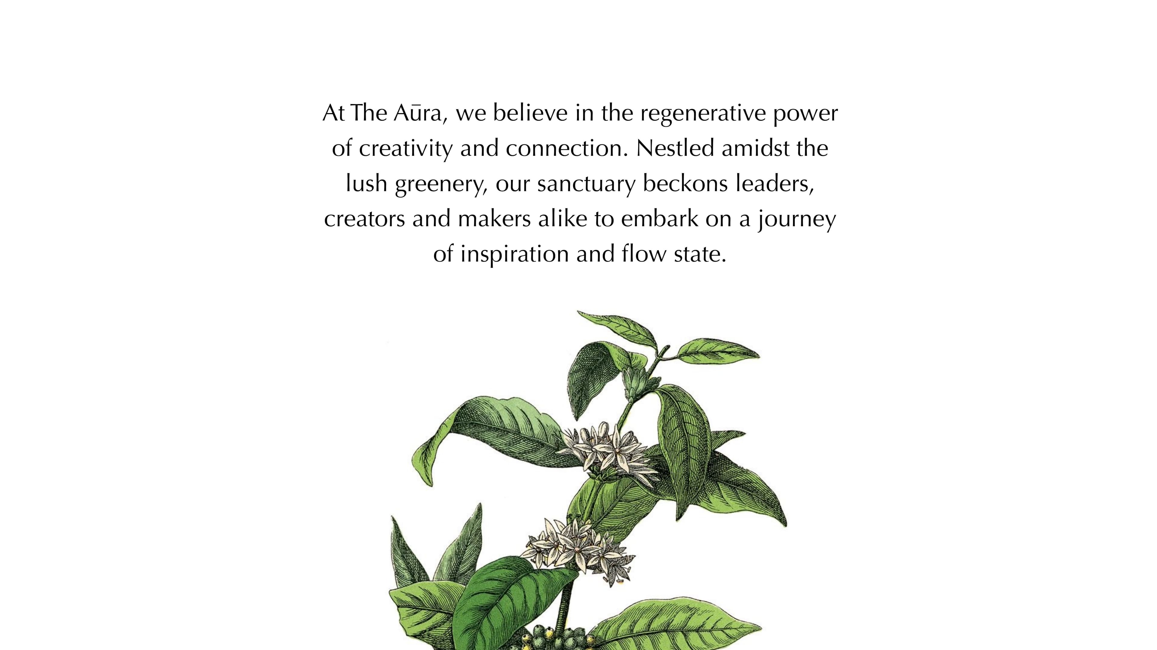
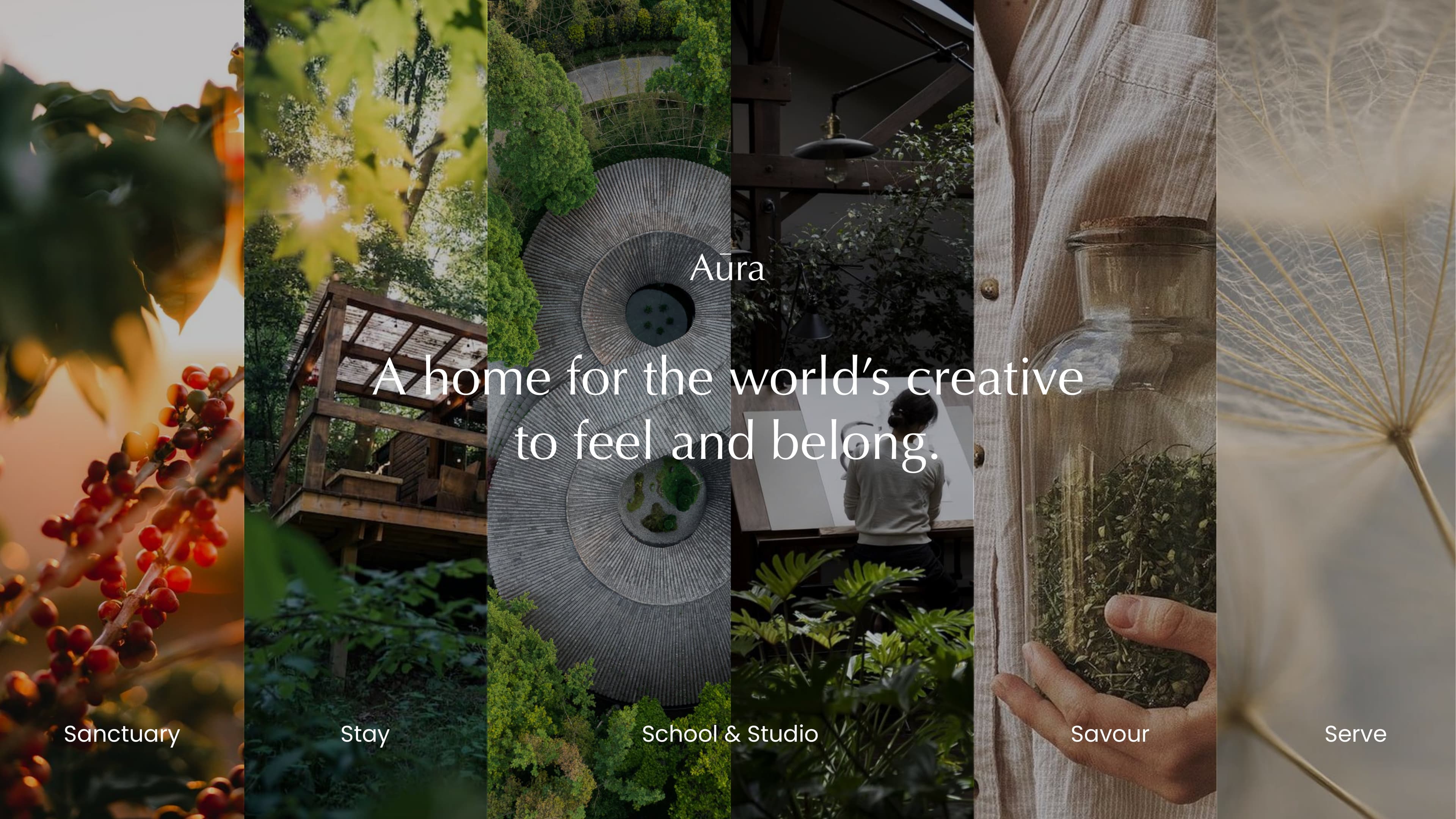
Aura is a regenerative ecosystem for monastic polymaths where Ancestral Intelligence and Creative Capital are deployed across 100 years.
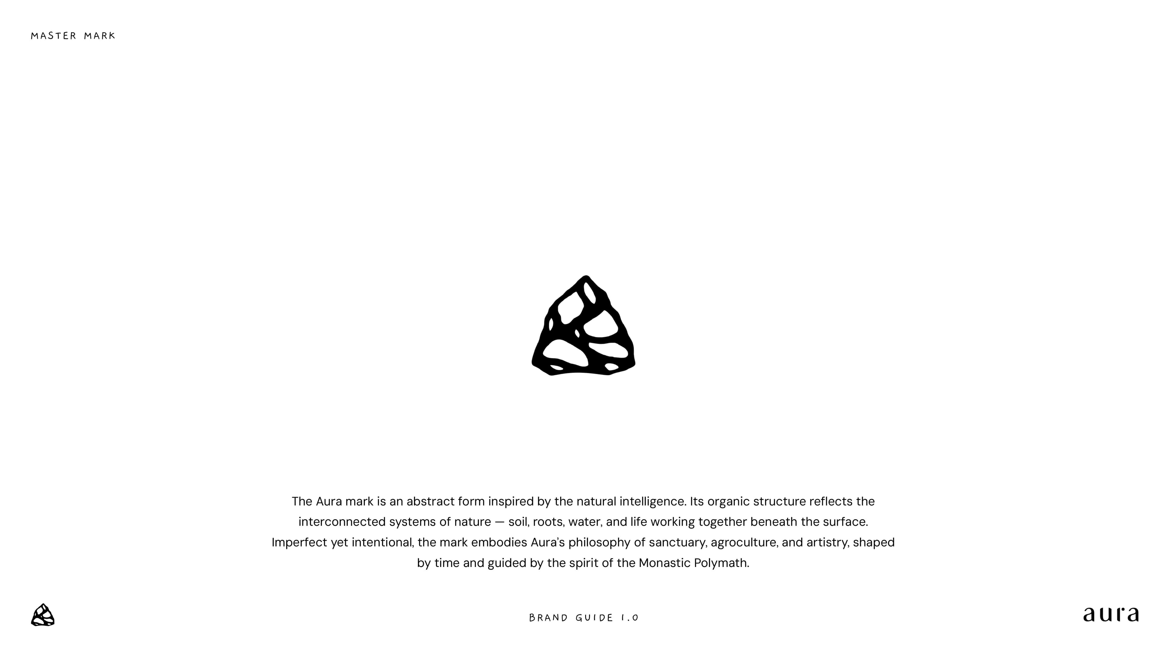
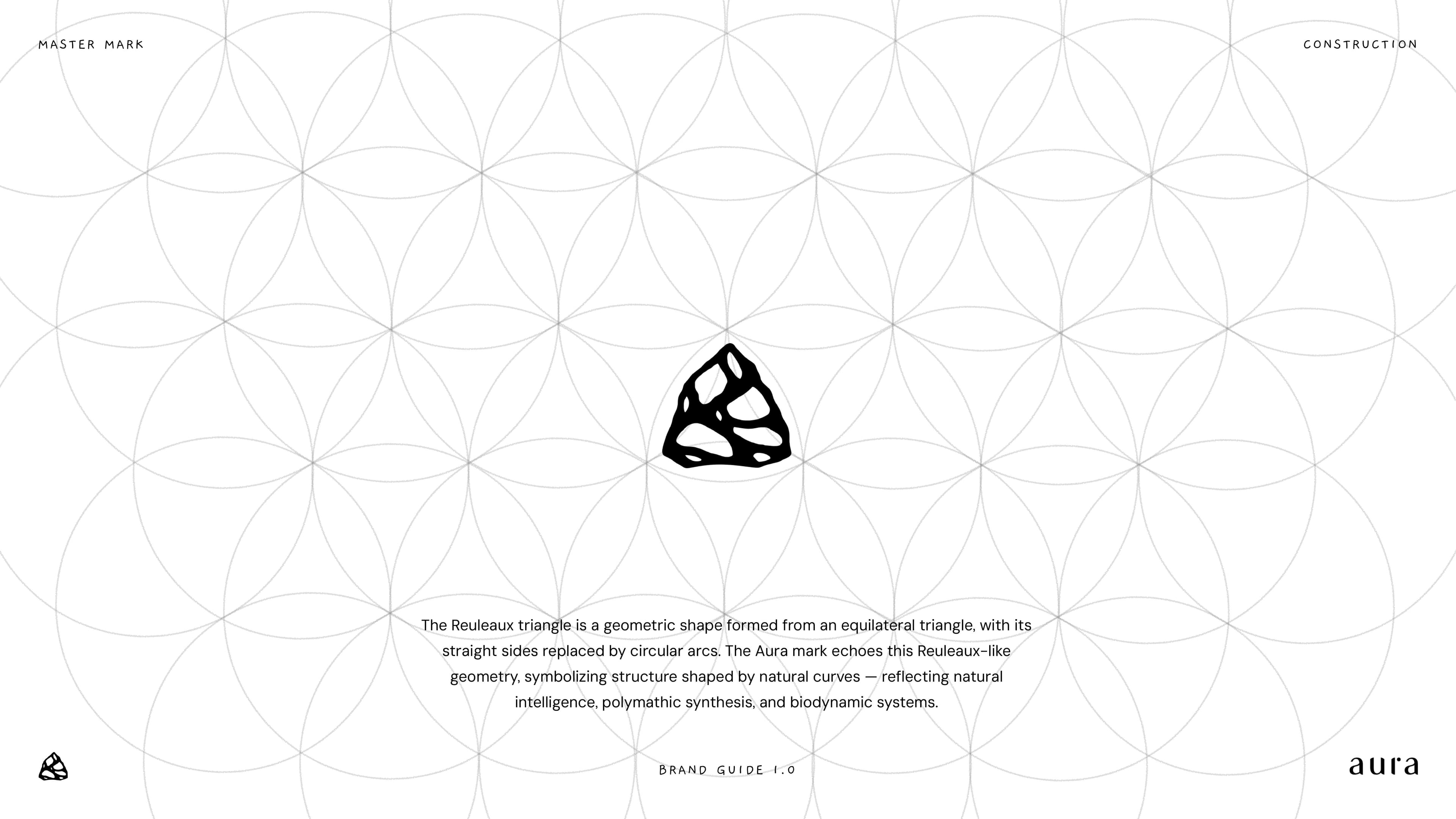
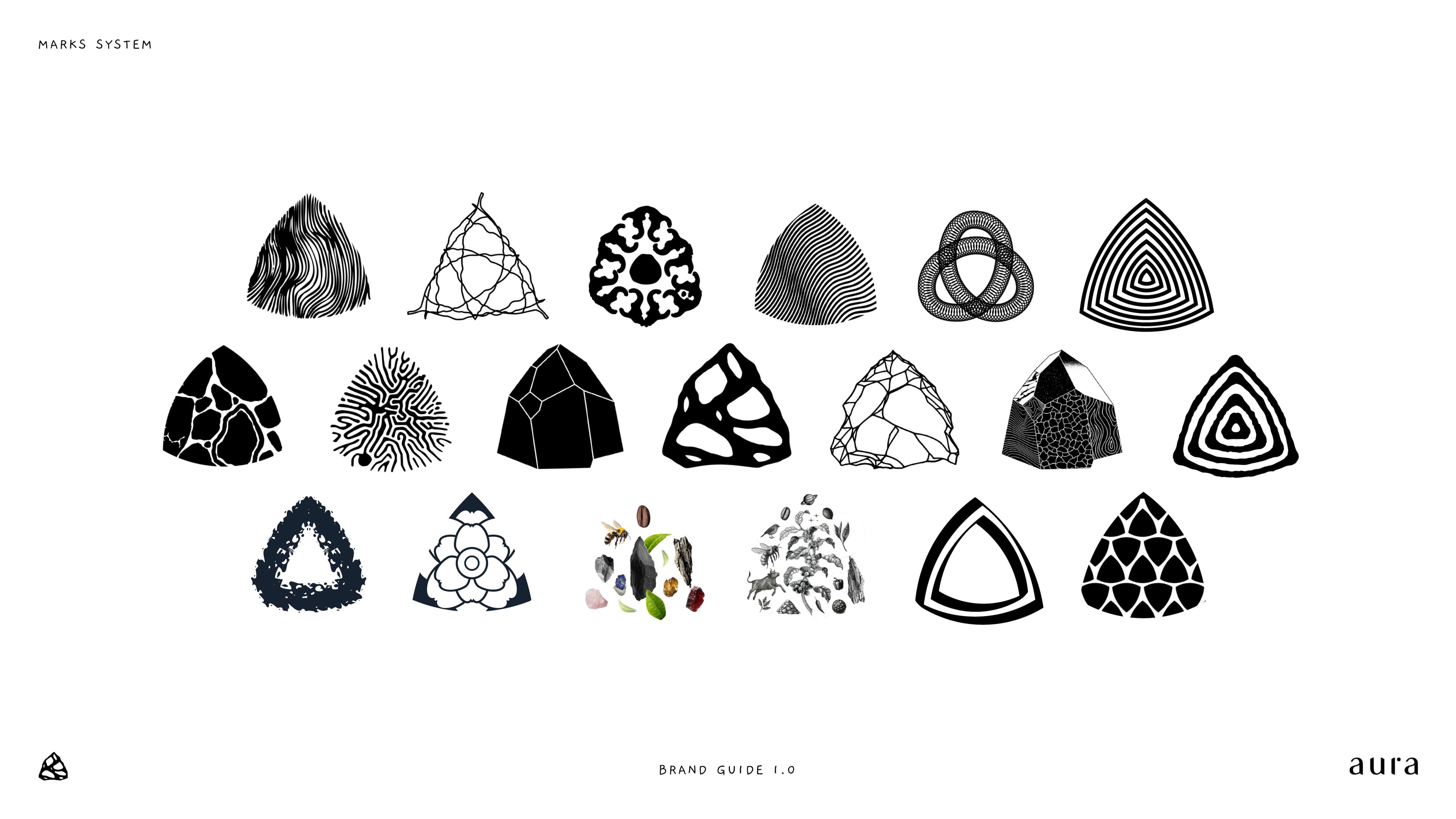
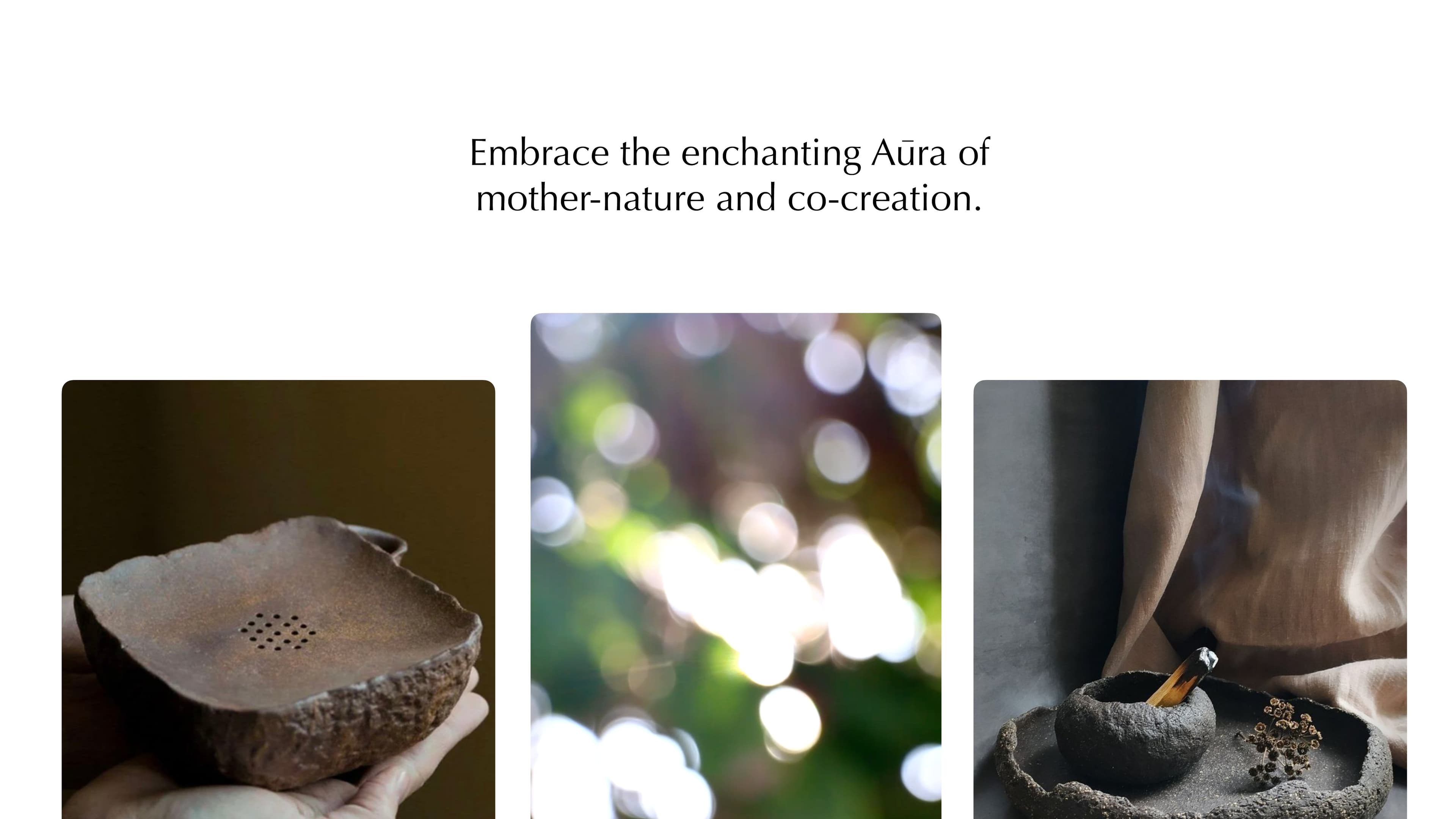
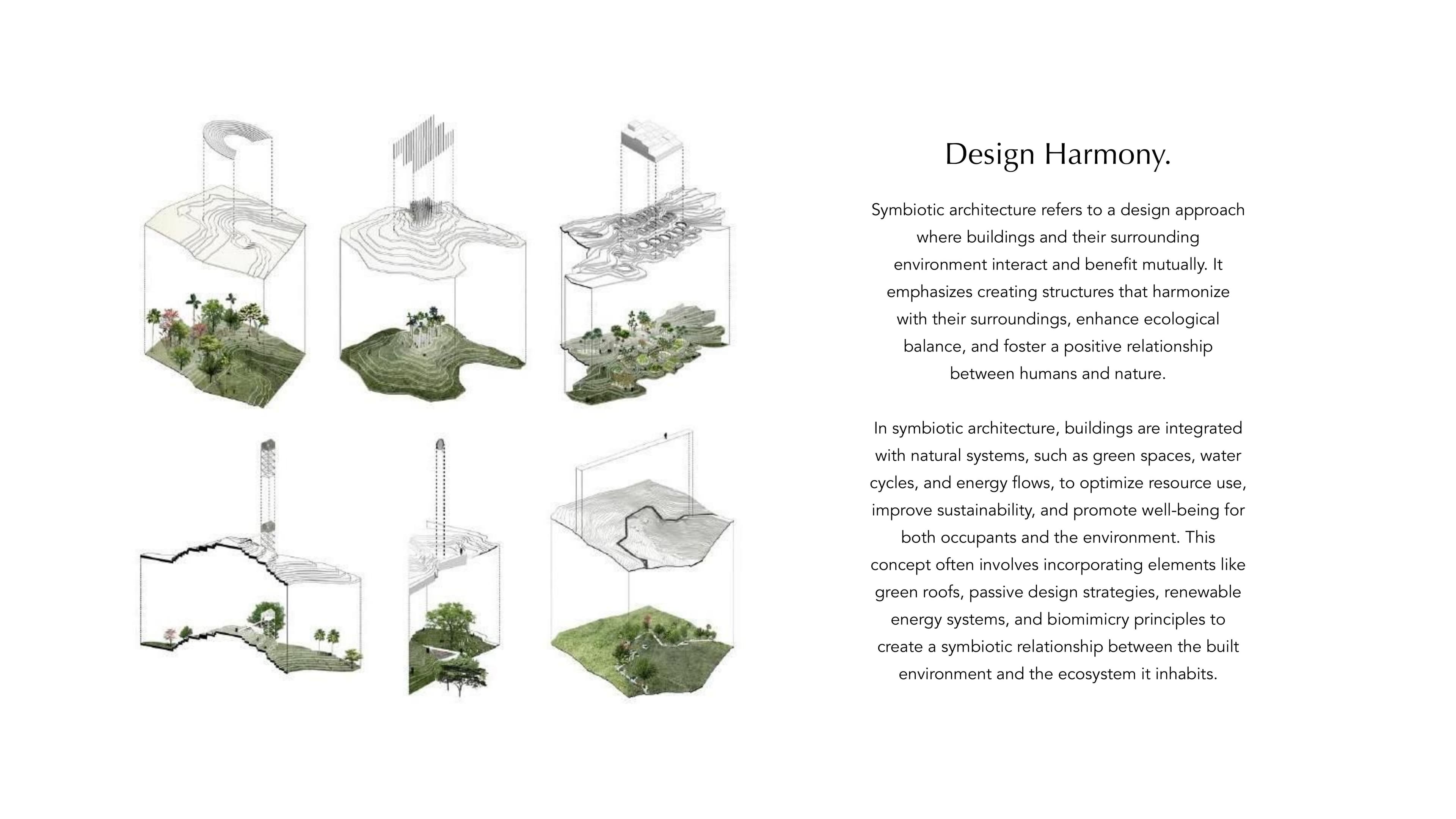
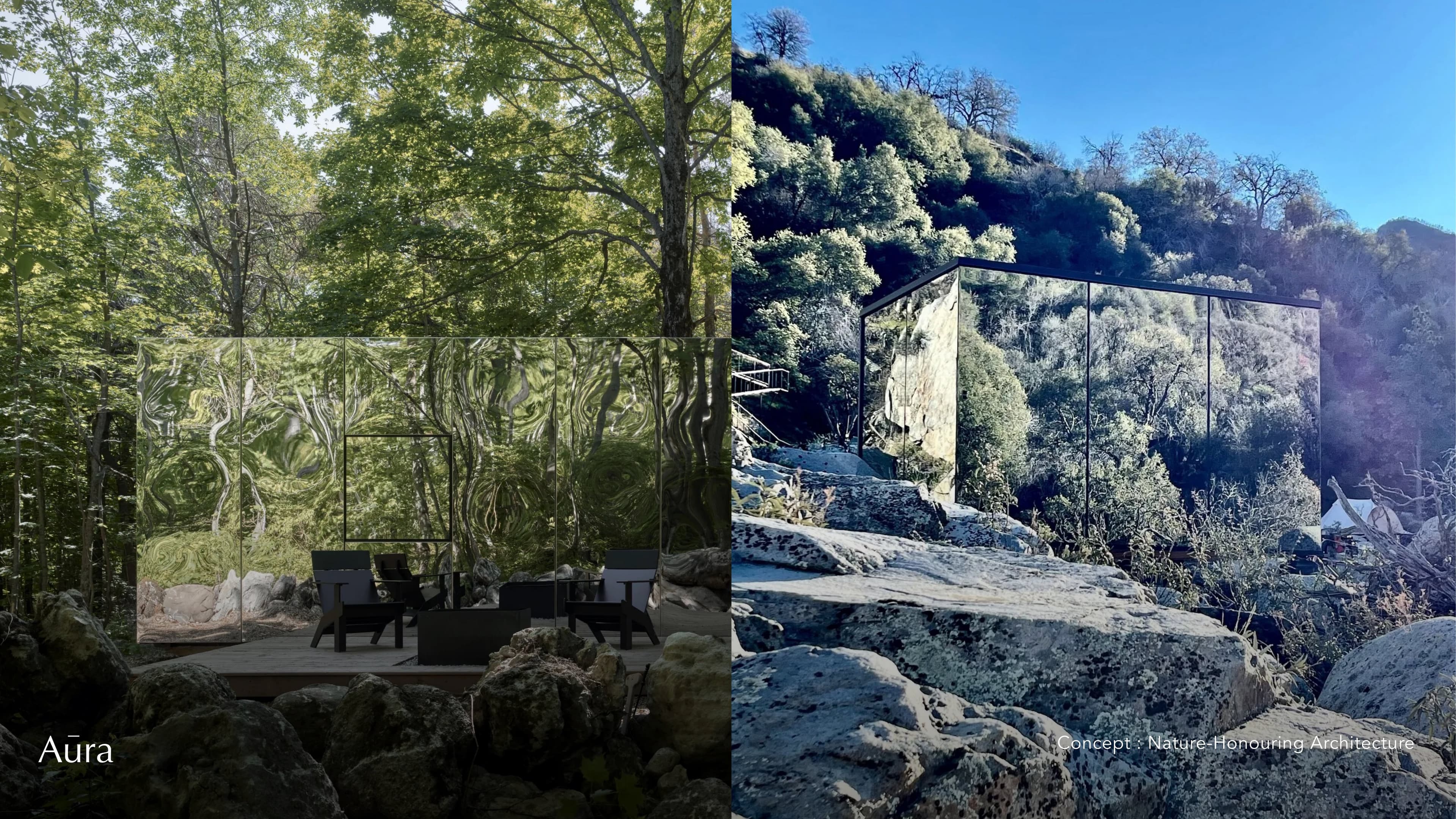
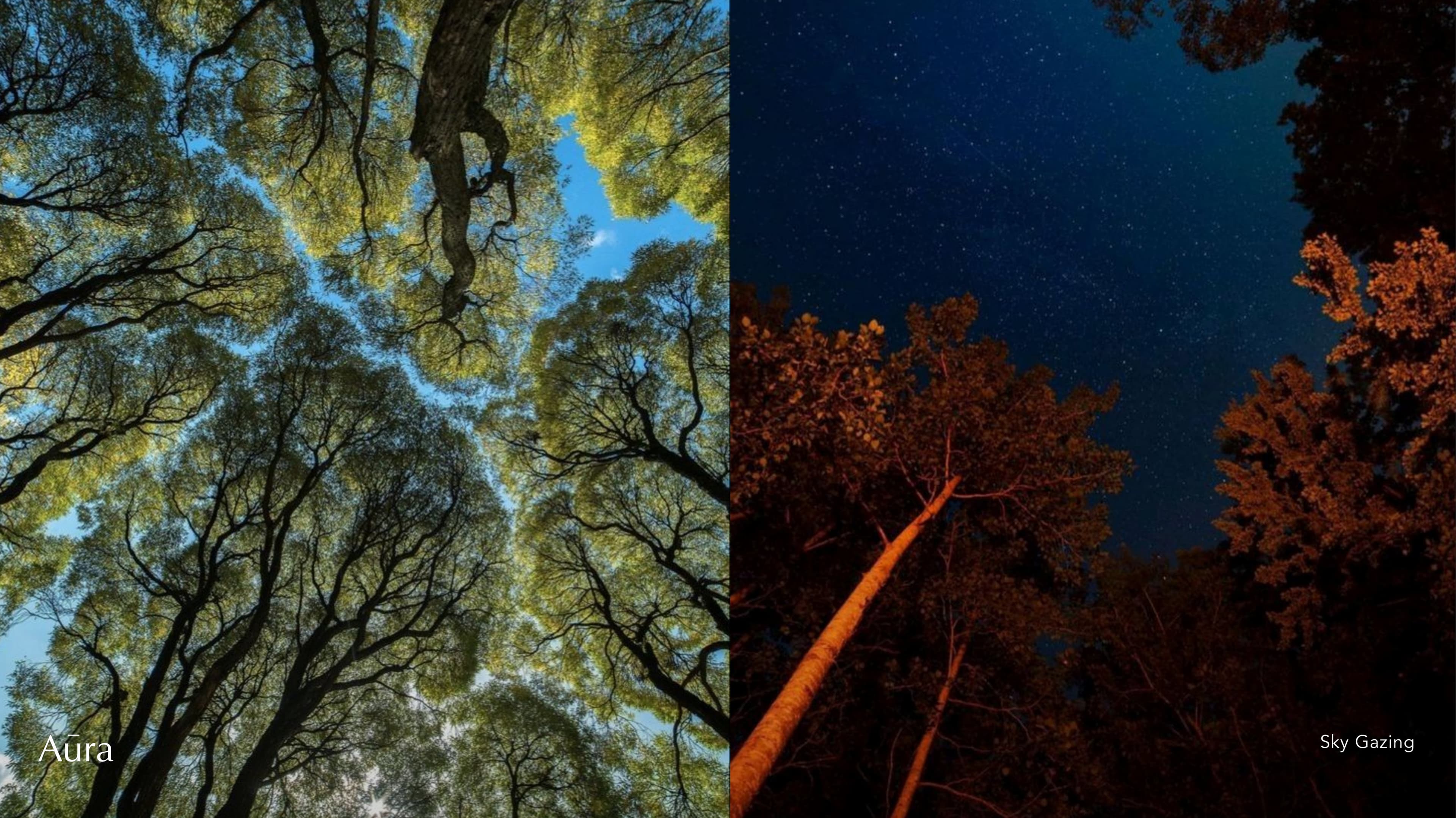
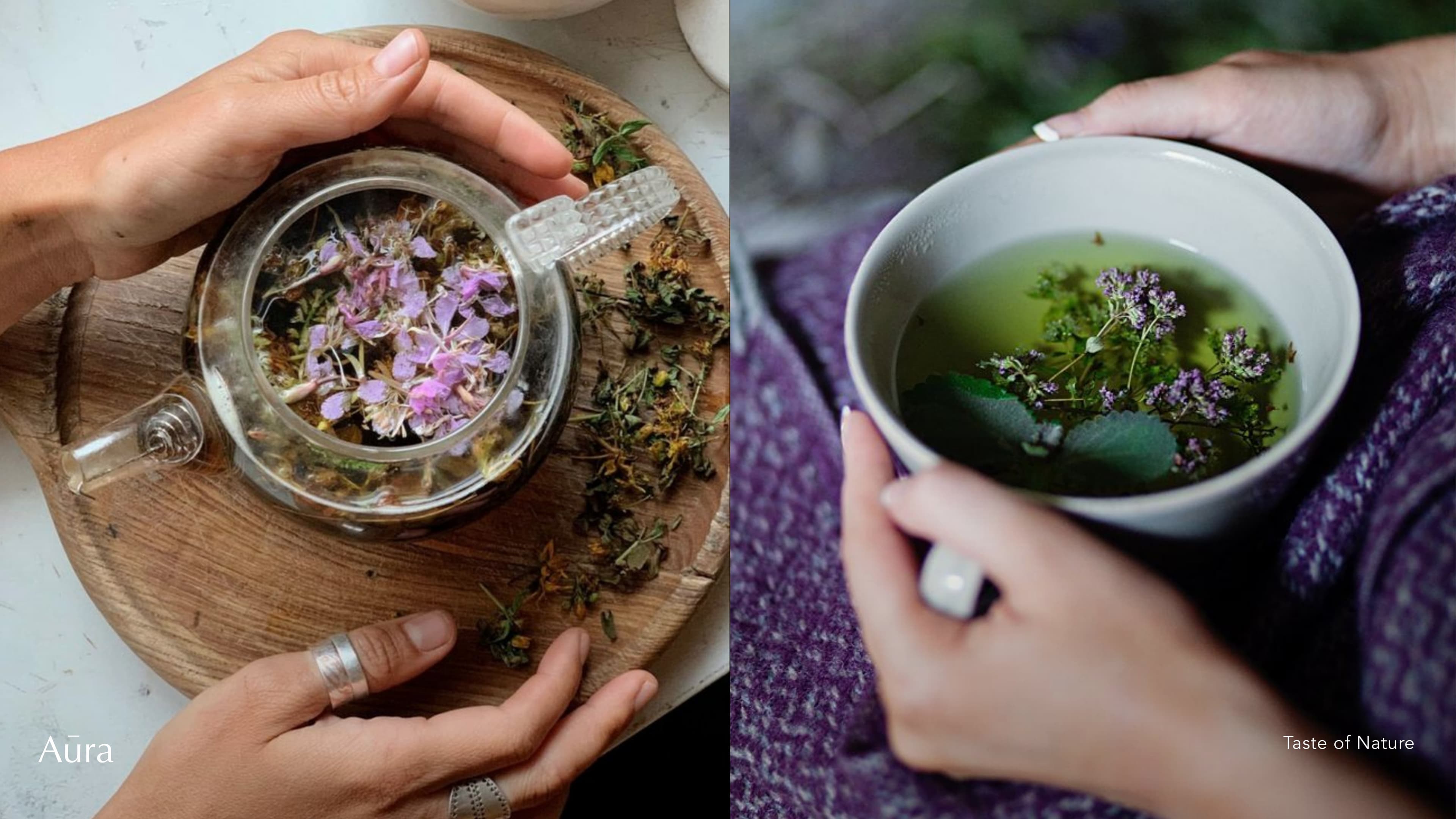
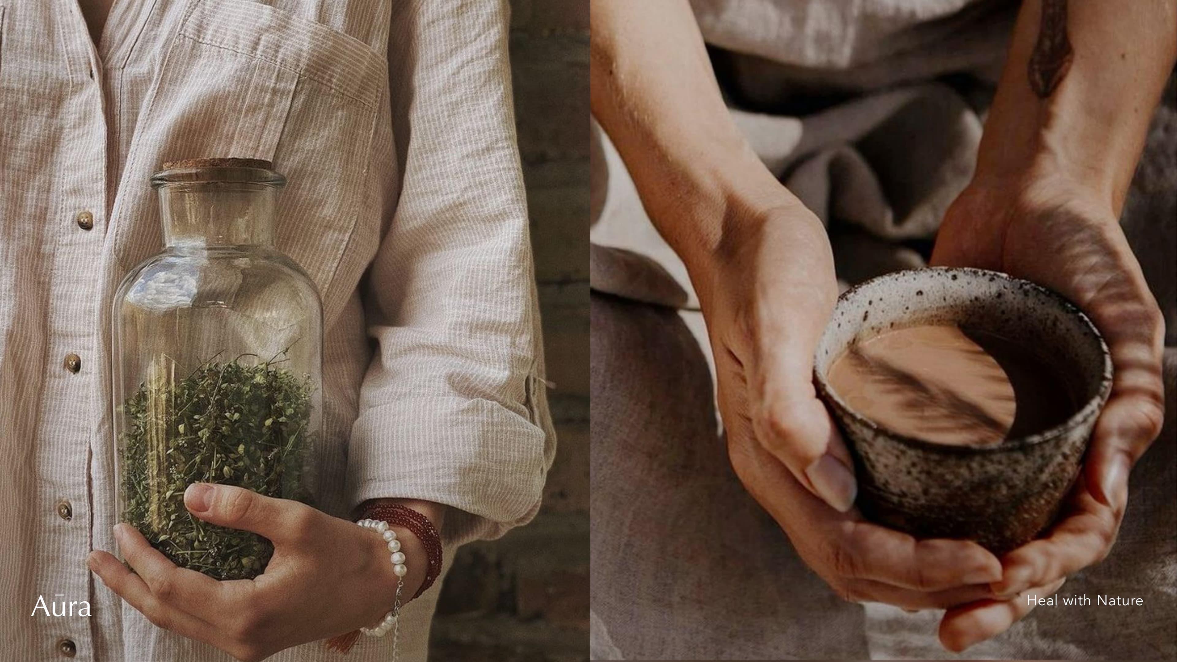
The brand identity is built around three intelligences: Natural, Human, and Machine. Design language favours silence over noise, depth over width, memory over trend.
Brand Principles
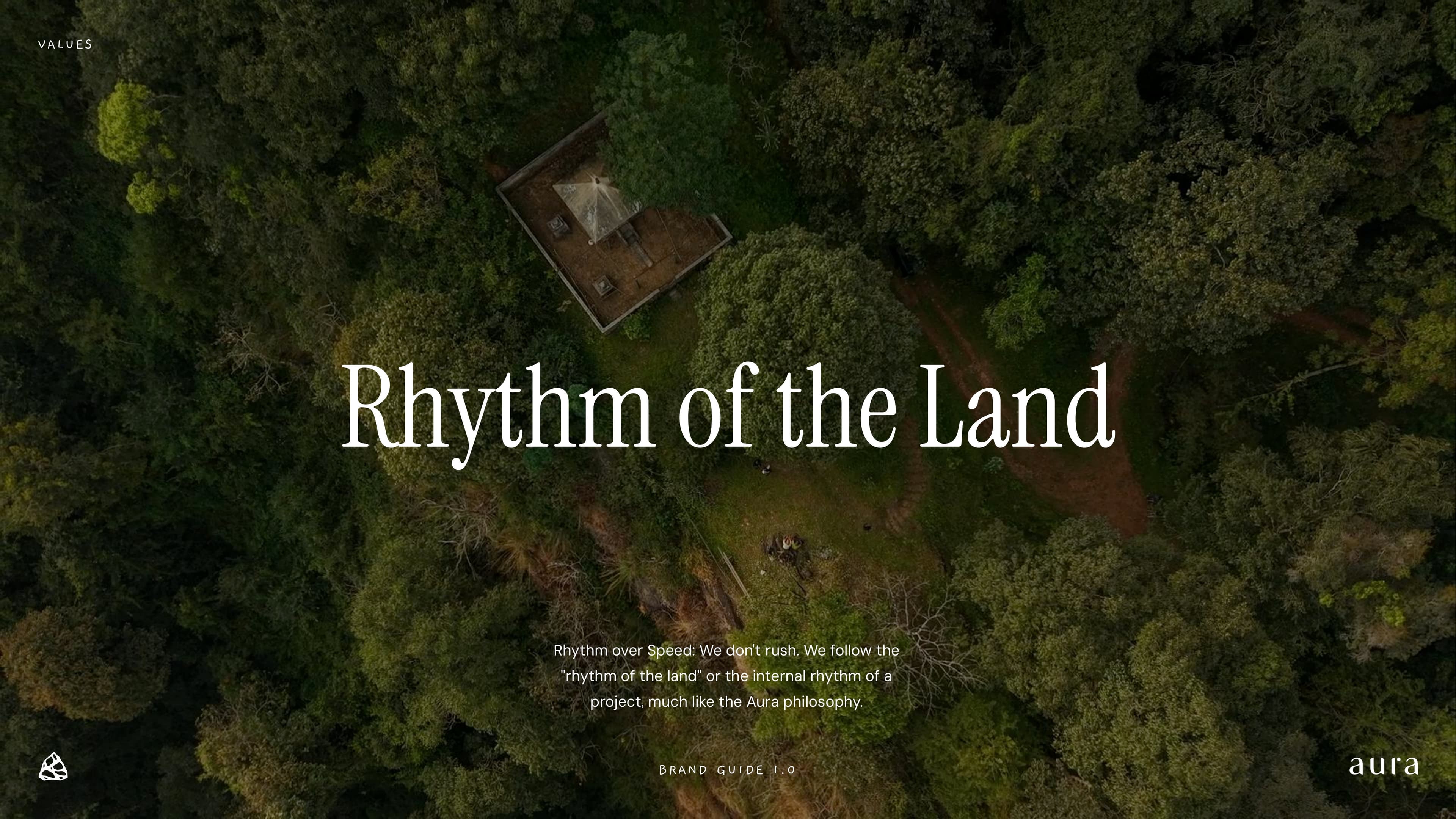
- Rhythm over Speed
- Depth over Width
- Silence over Noise
- Memory over Trend
- Quality before Quantity
- Think 10 years ahead
Brand Colours
- #CA4926 — Dry Osmosis
- #DD7C37 — Red Honey
- #E4B239 — Banana Wash
- #E1ADA2 — Solera Maceration
- #A5B6C8 — Solera Wash
- #B6B050 — Grappa
- #7A7C5C — Volcanic
- #FFFFFF — Appassimento
Typography
- Display — Instrument Serif, 400
- Body — DM Sans, 400
- Mono — DM Mono, 400
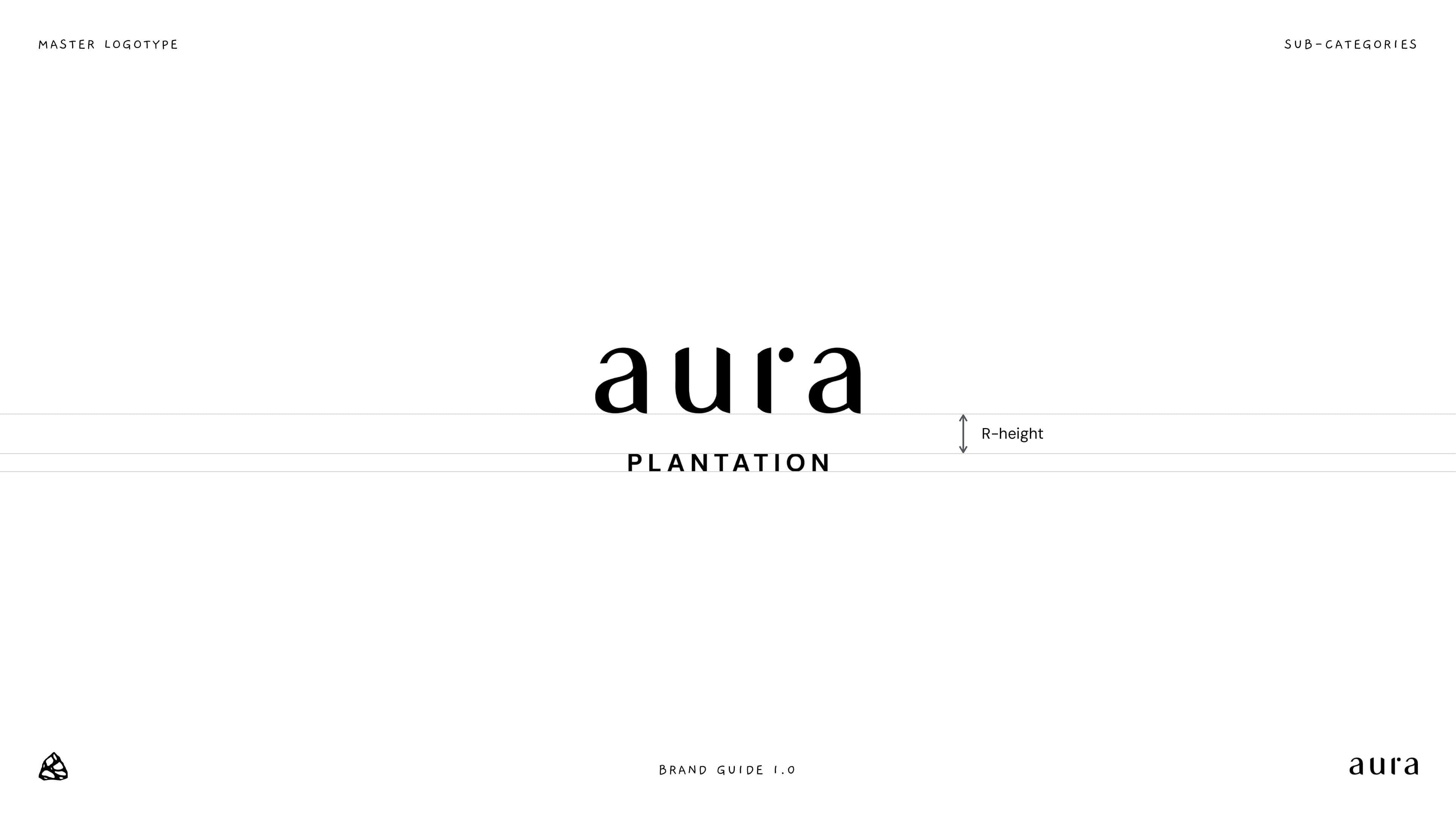
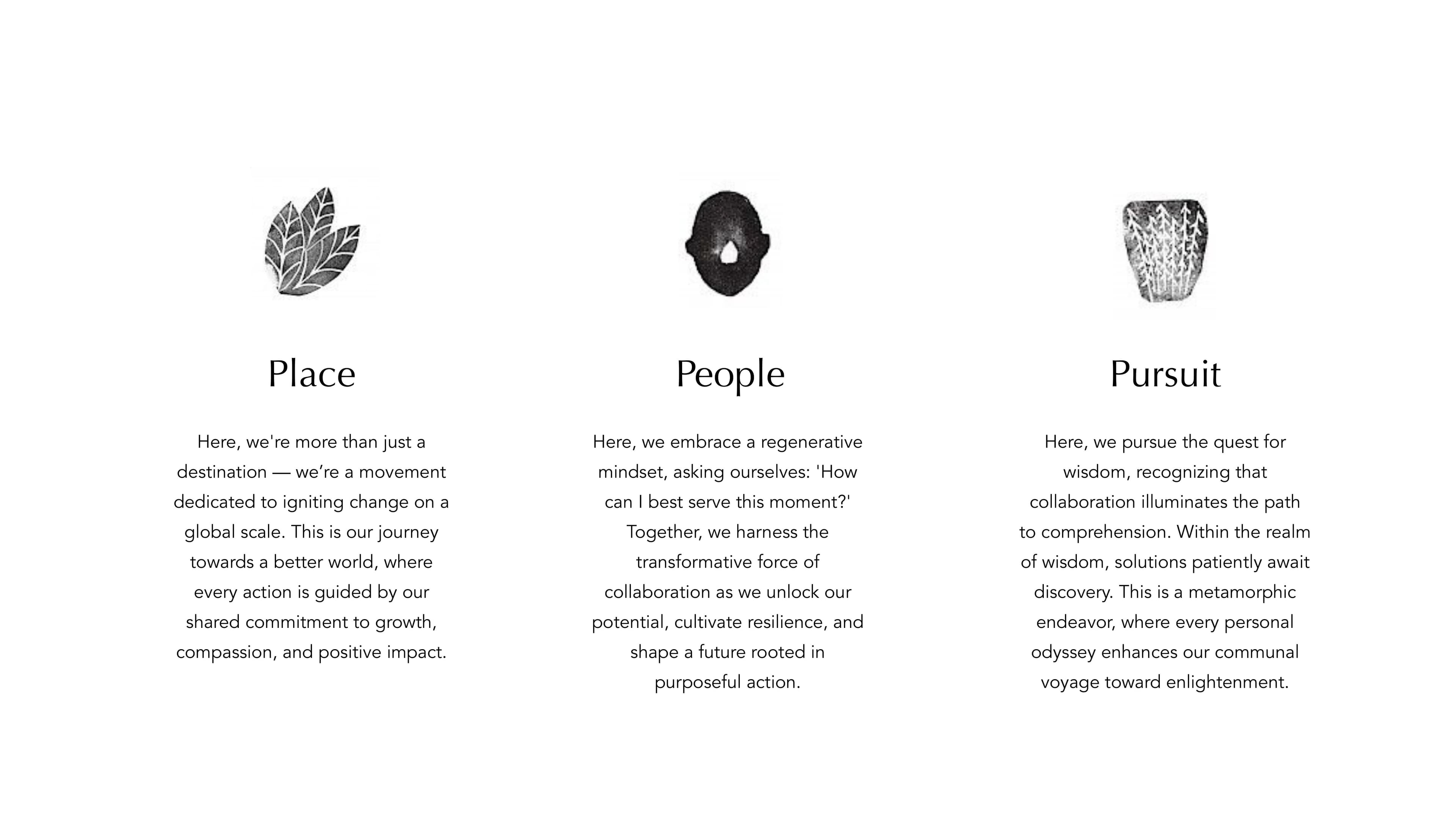
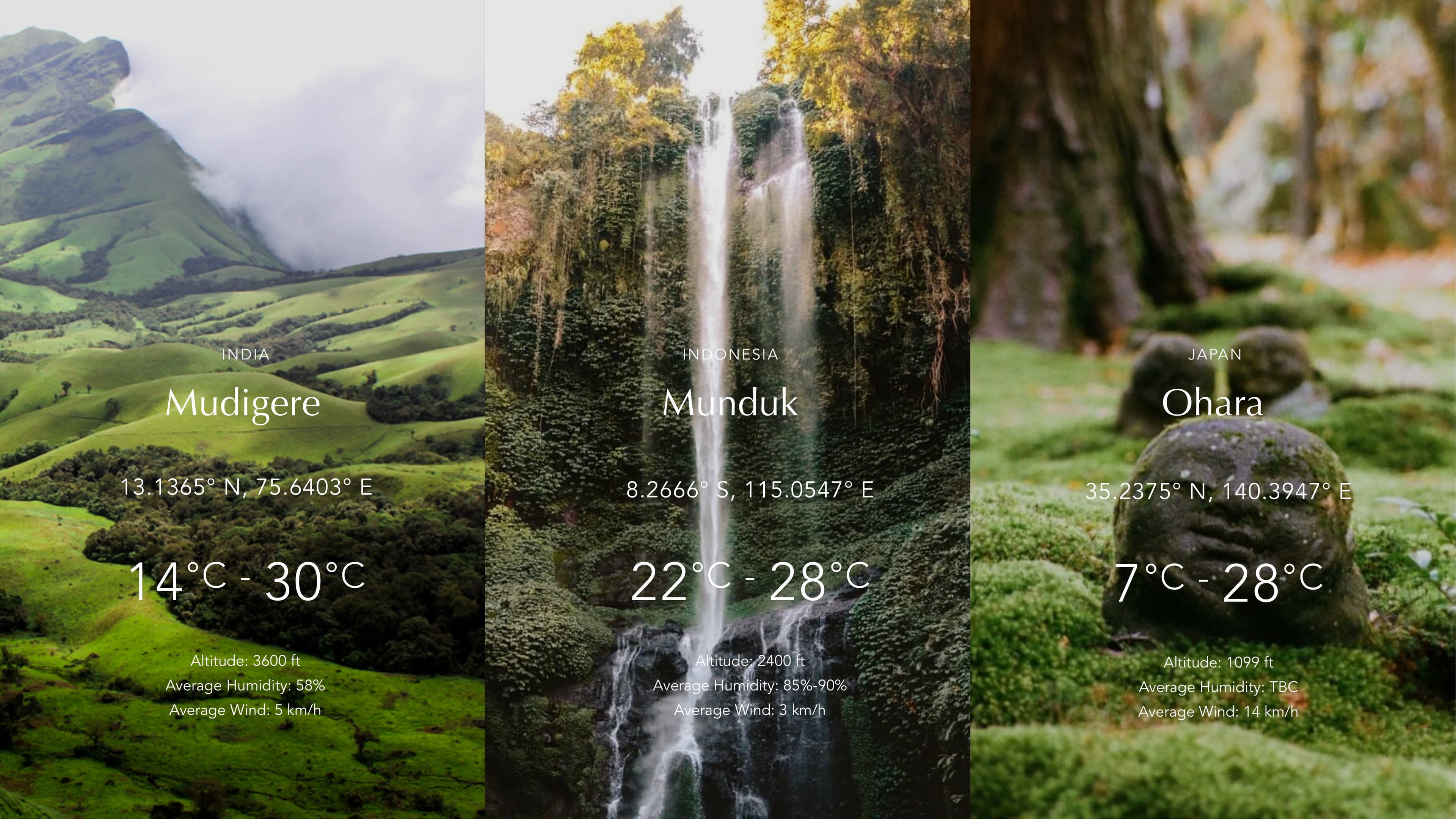
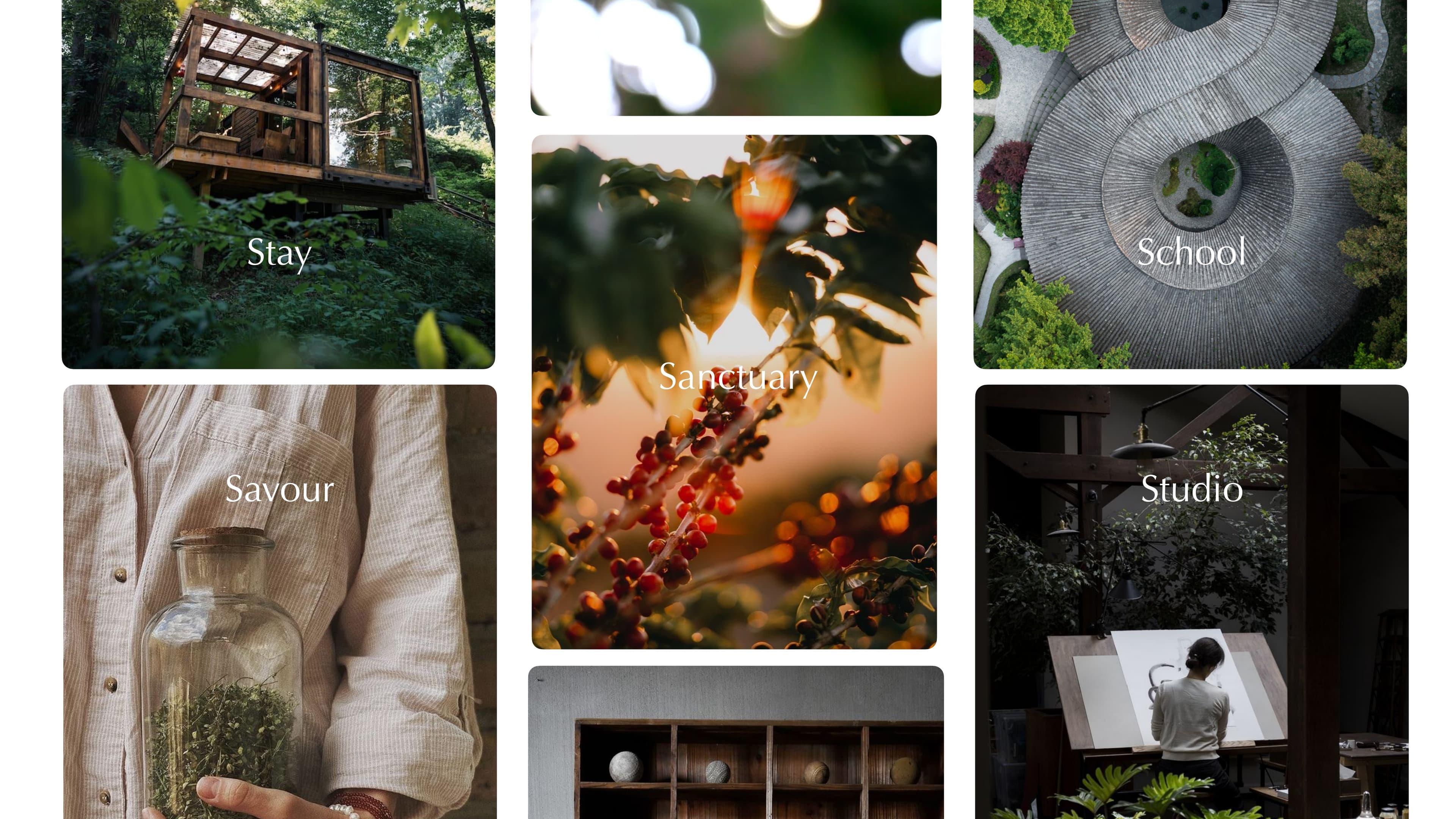
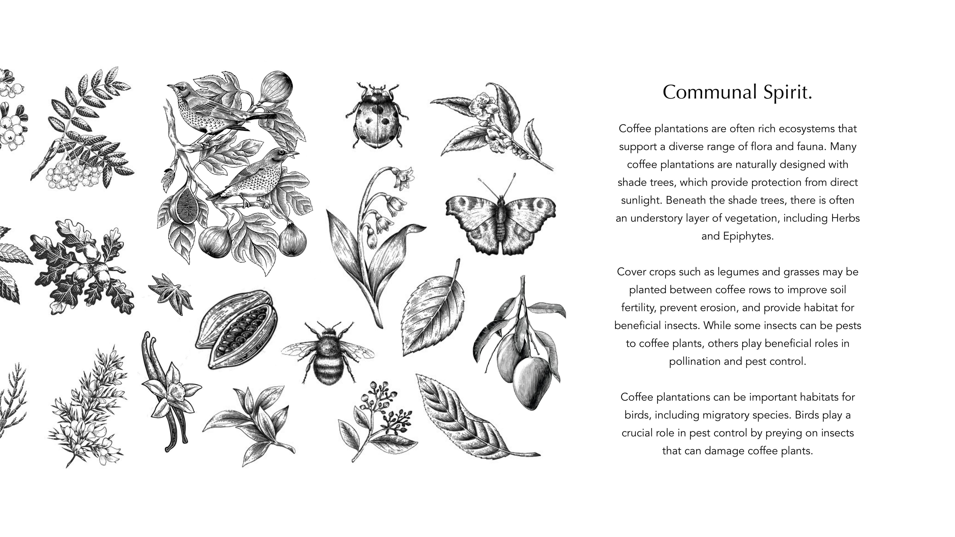
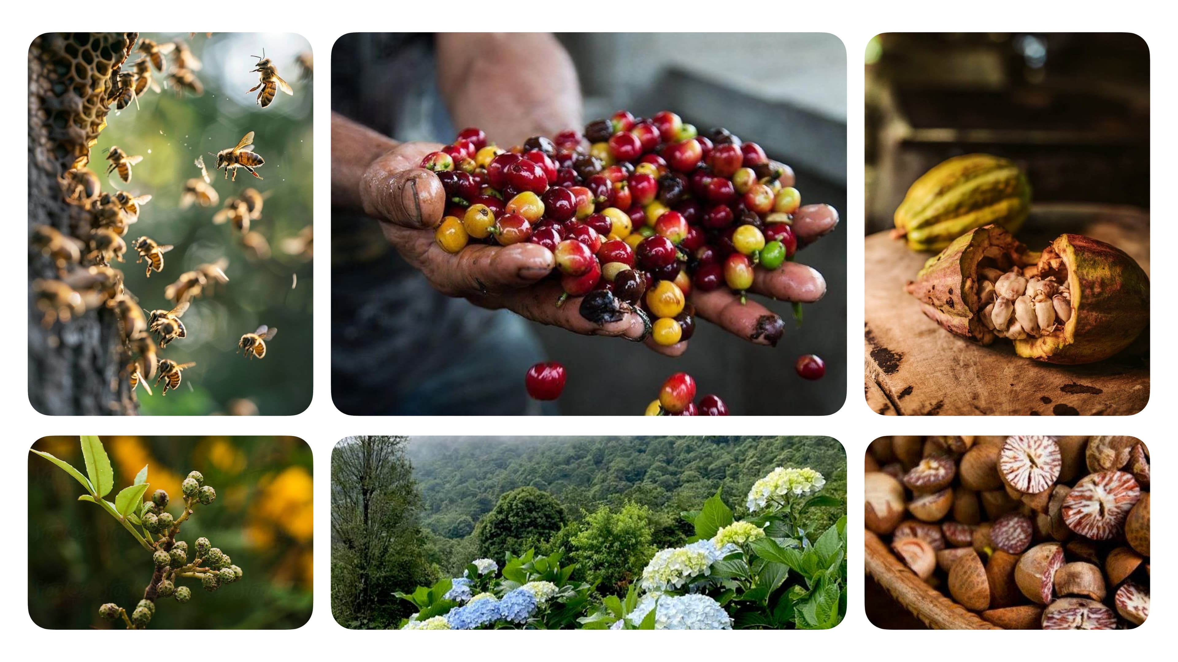
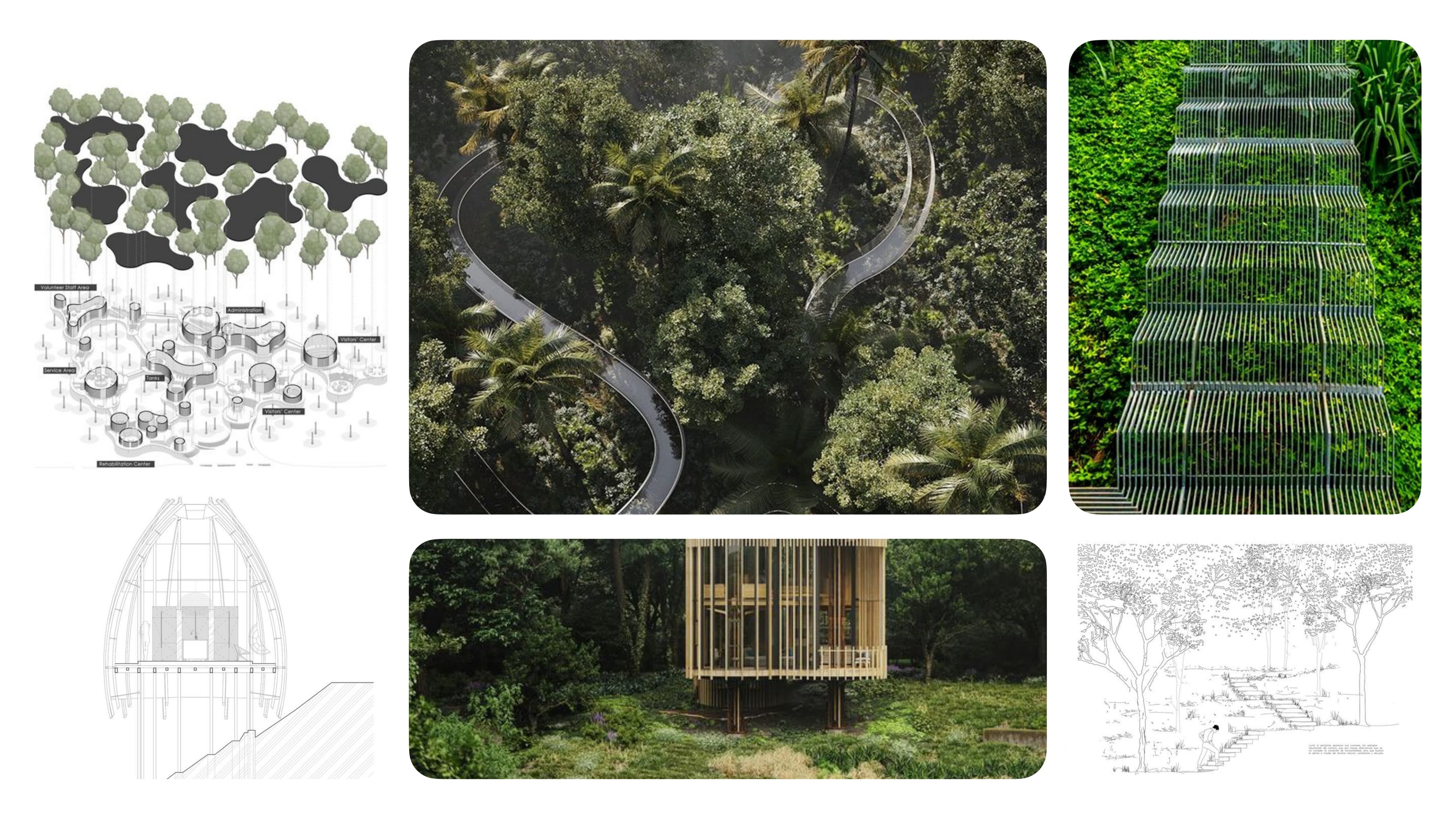
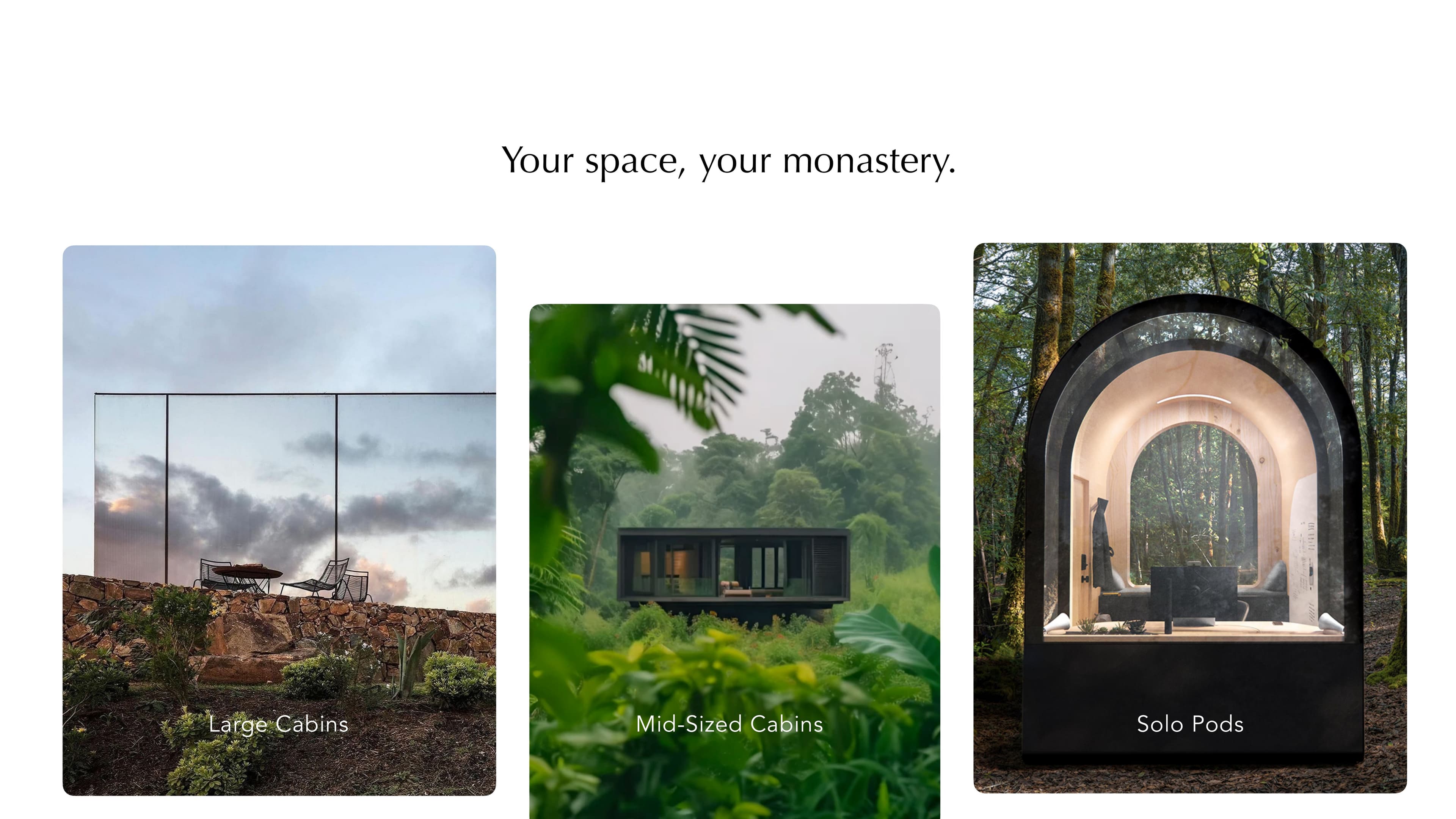
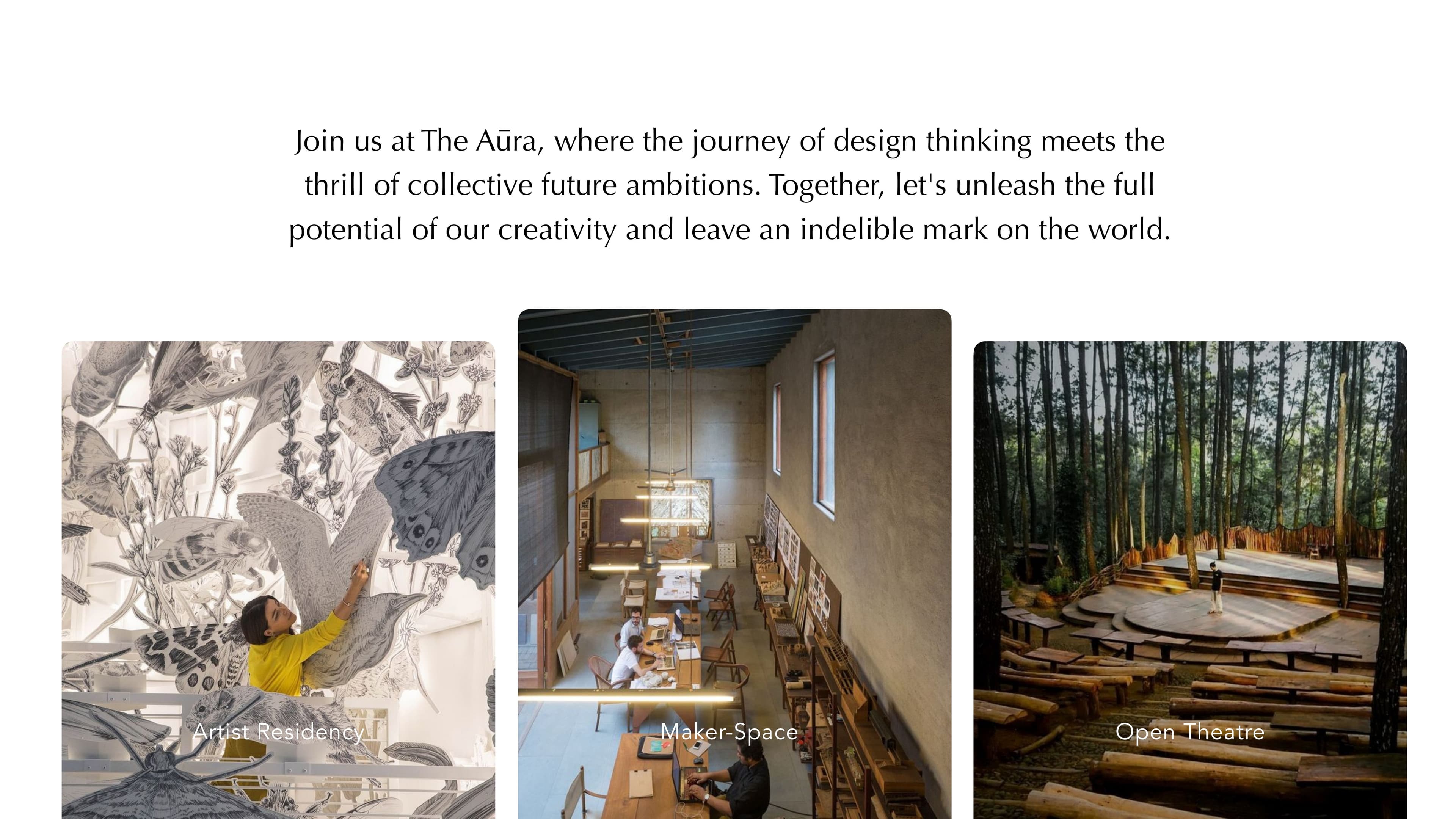
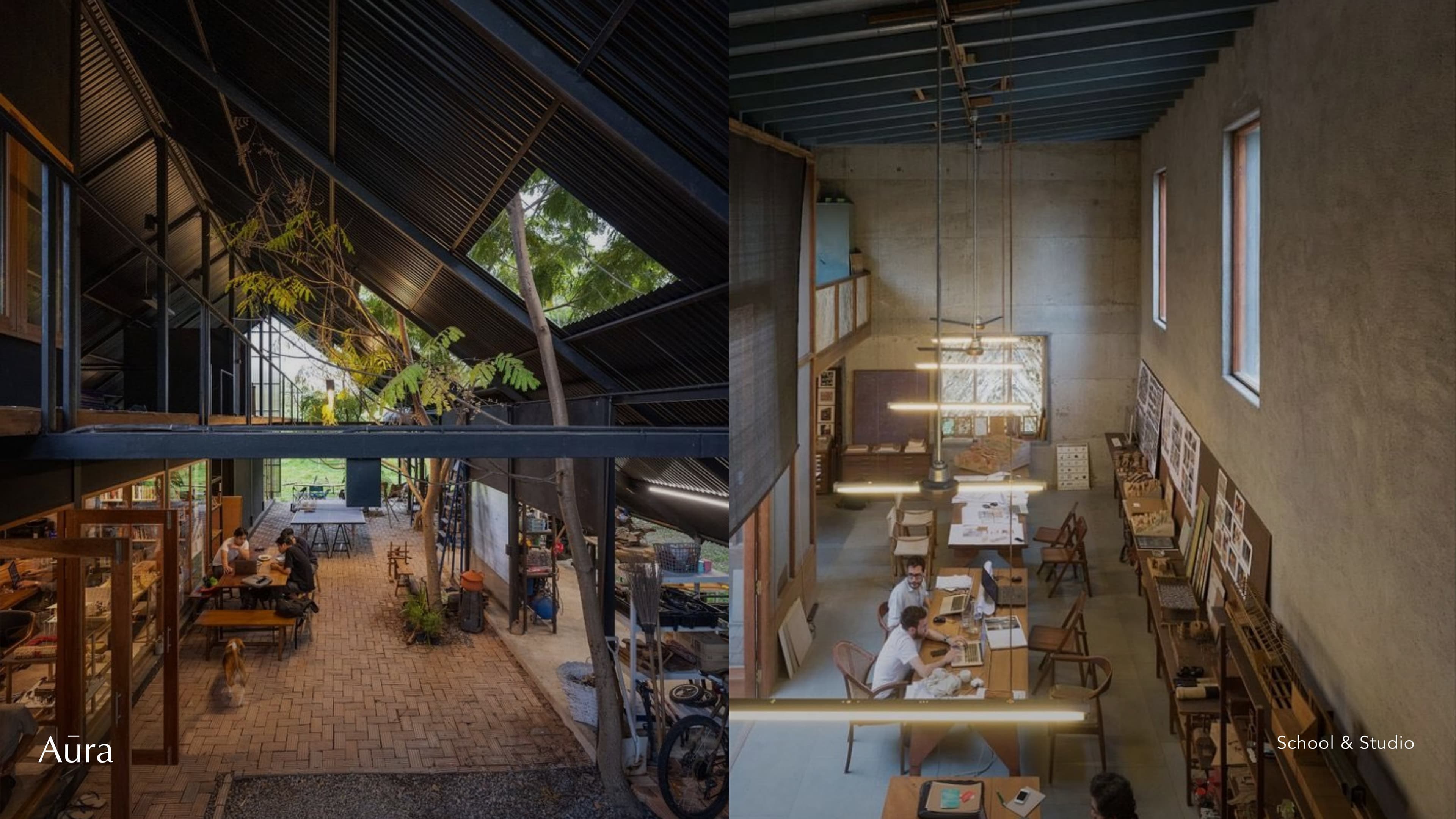
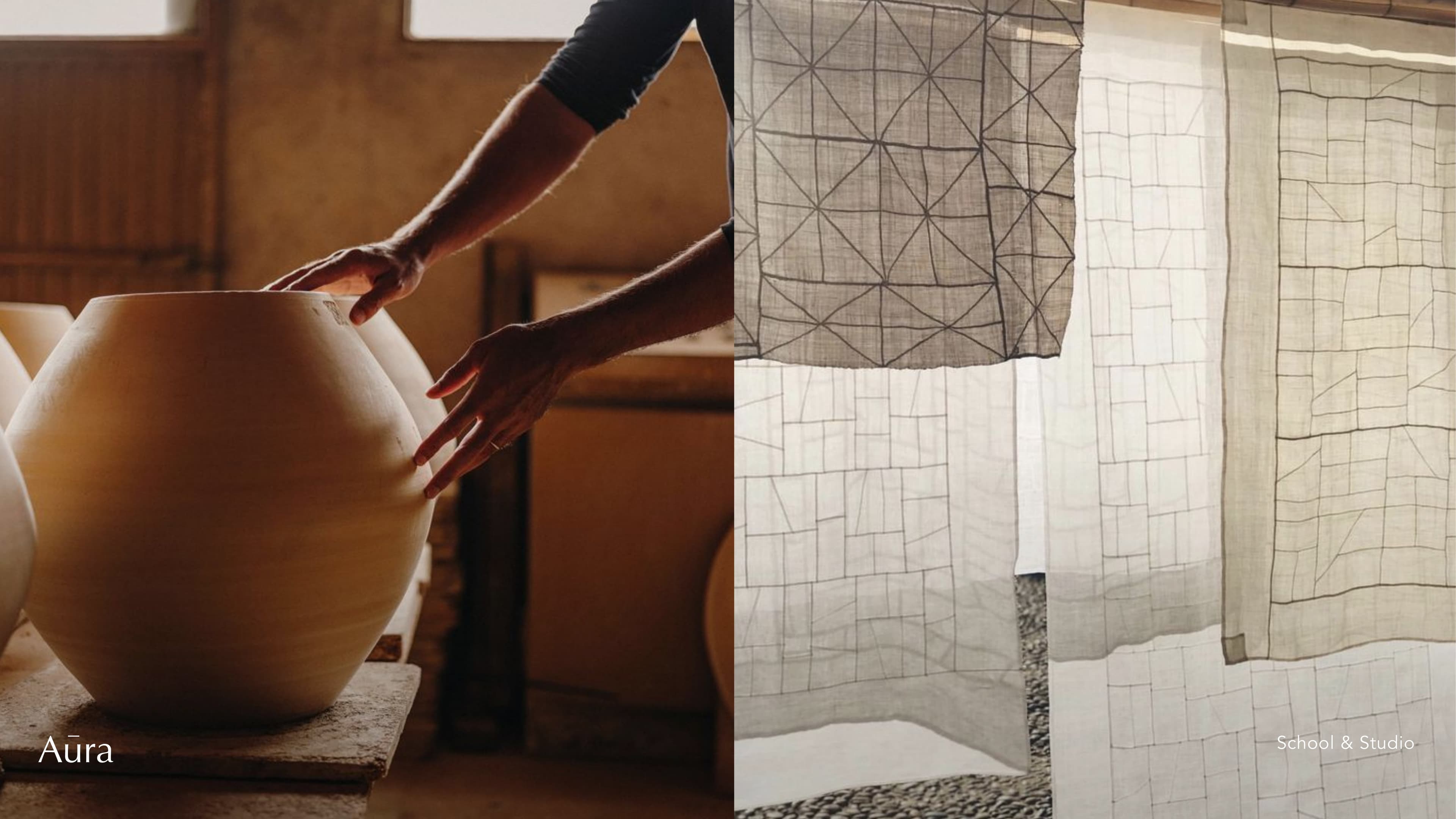
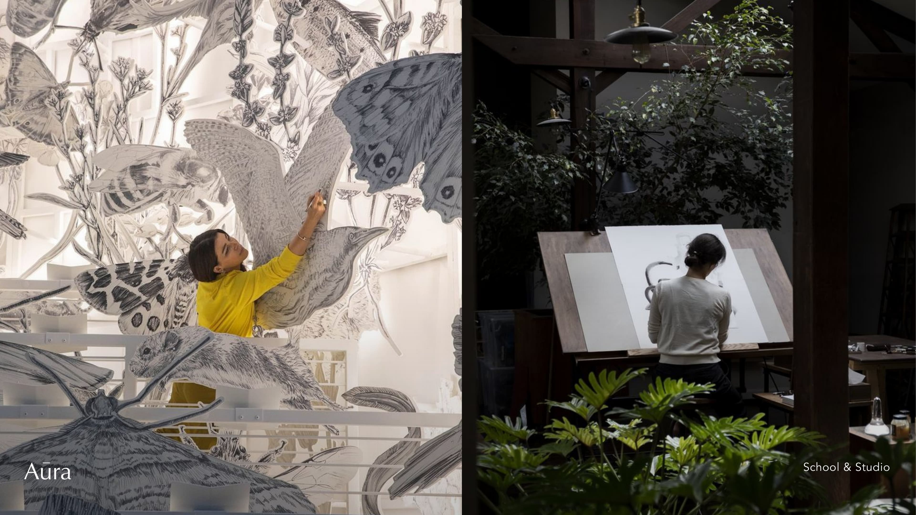
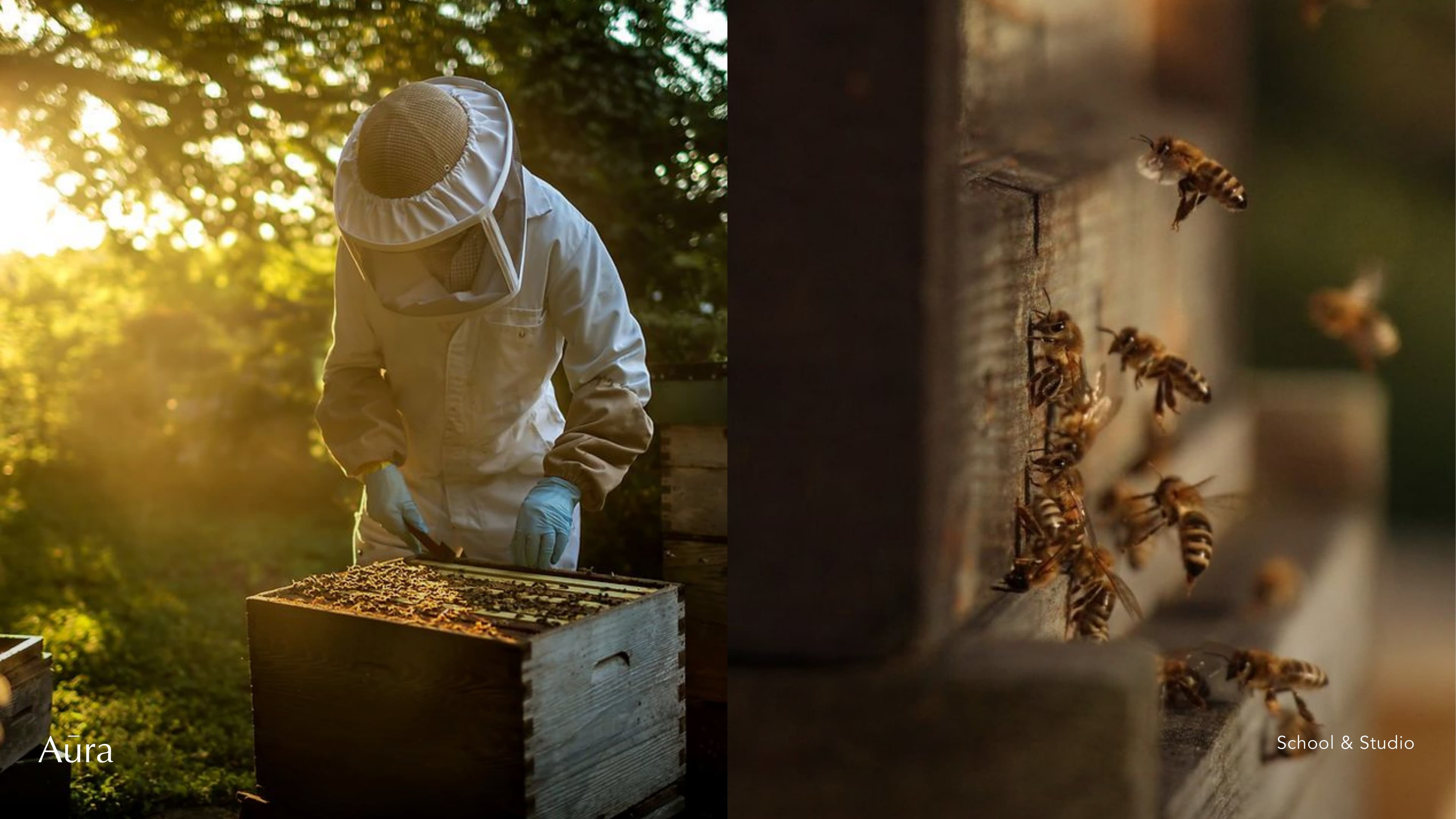
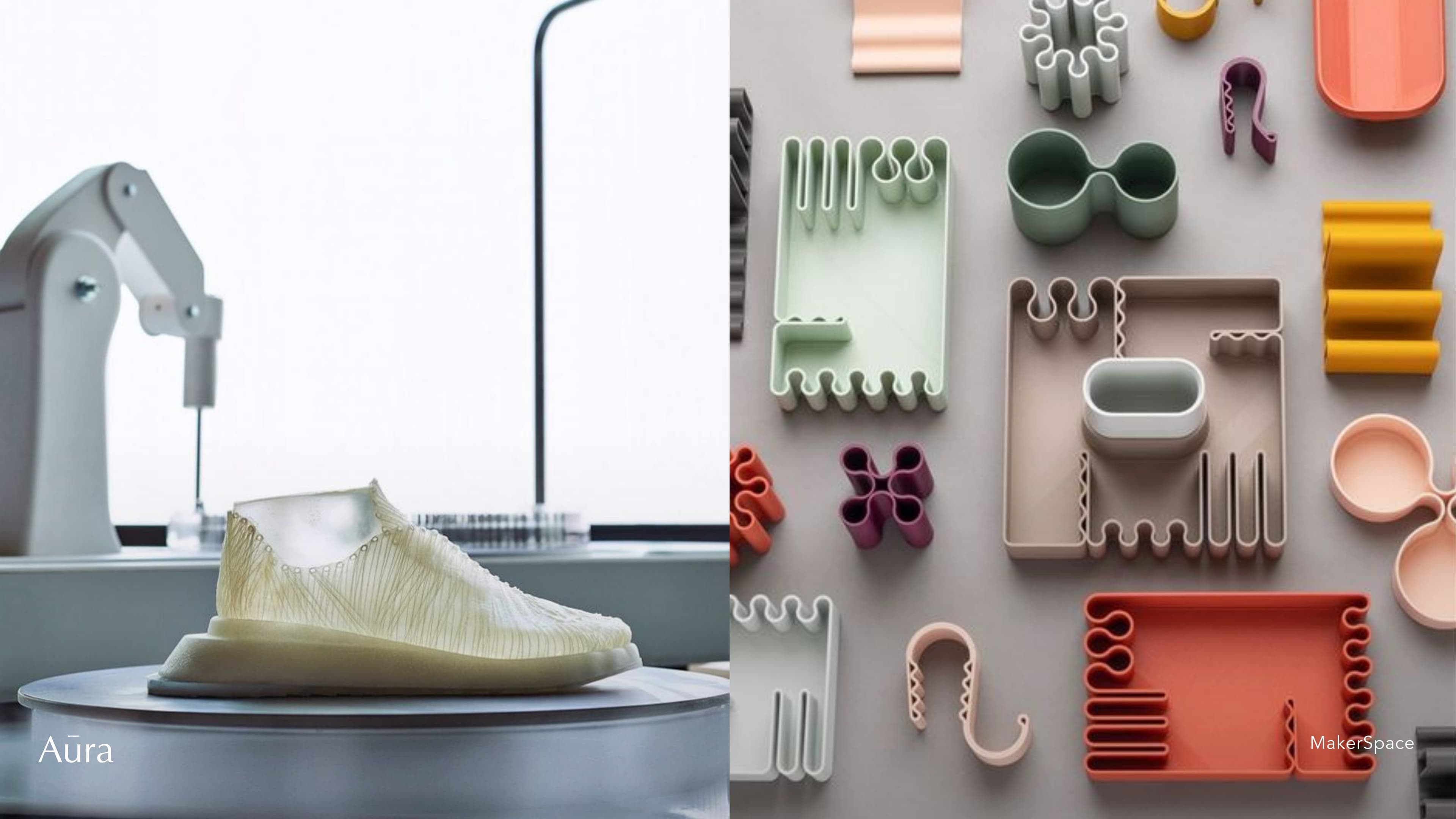
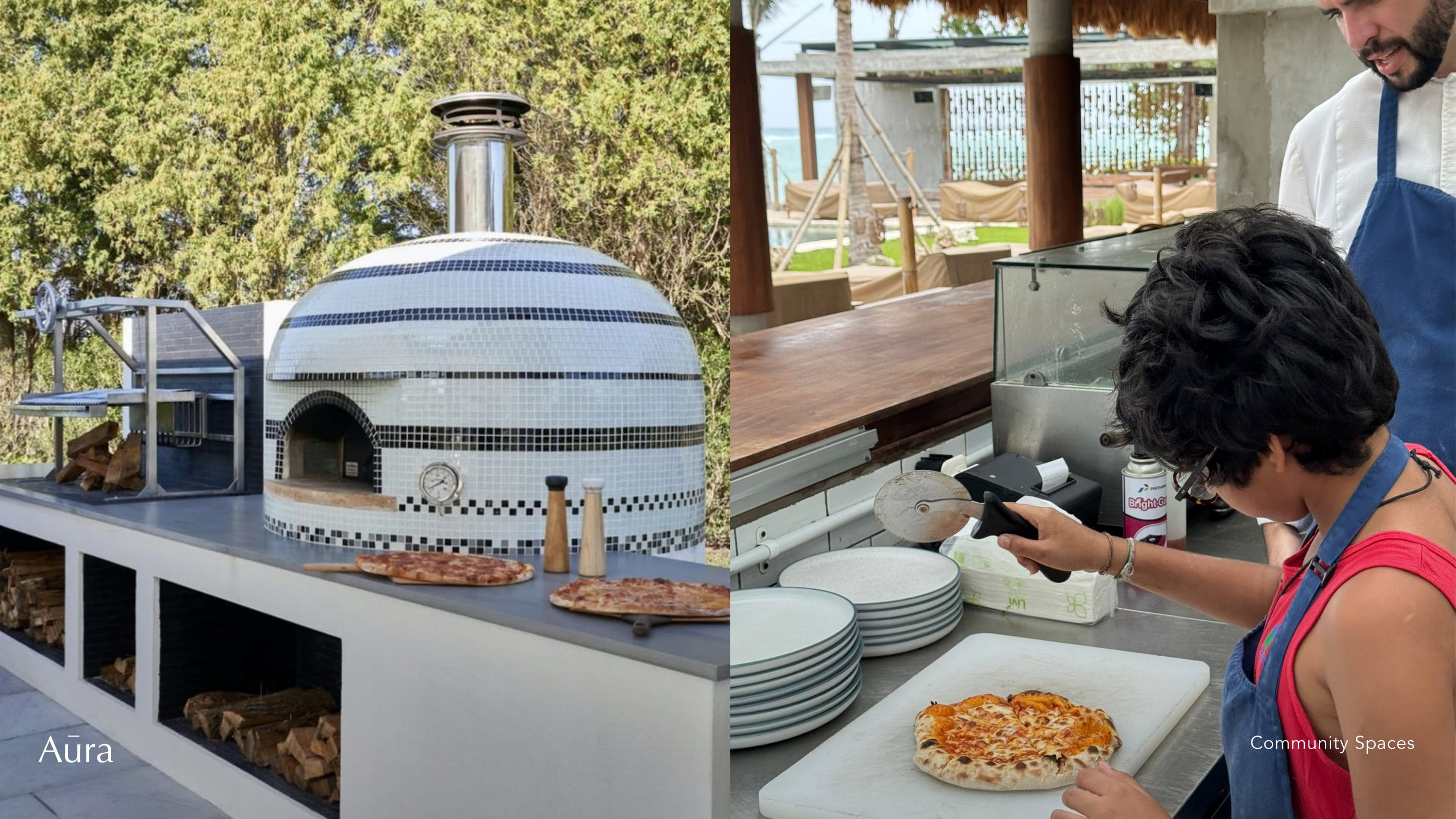
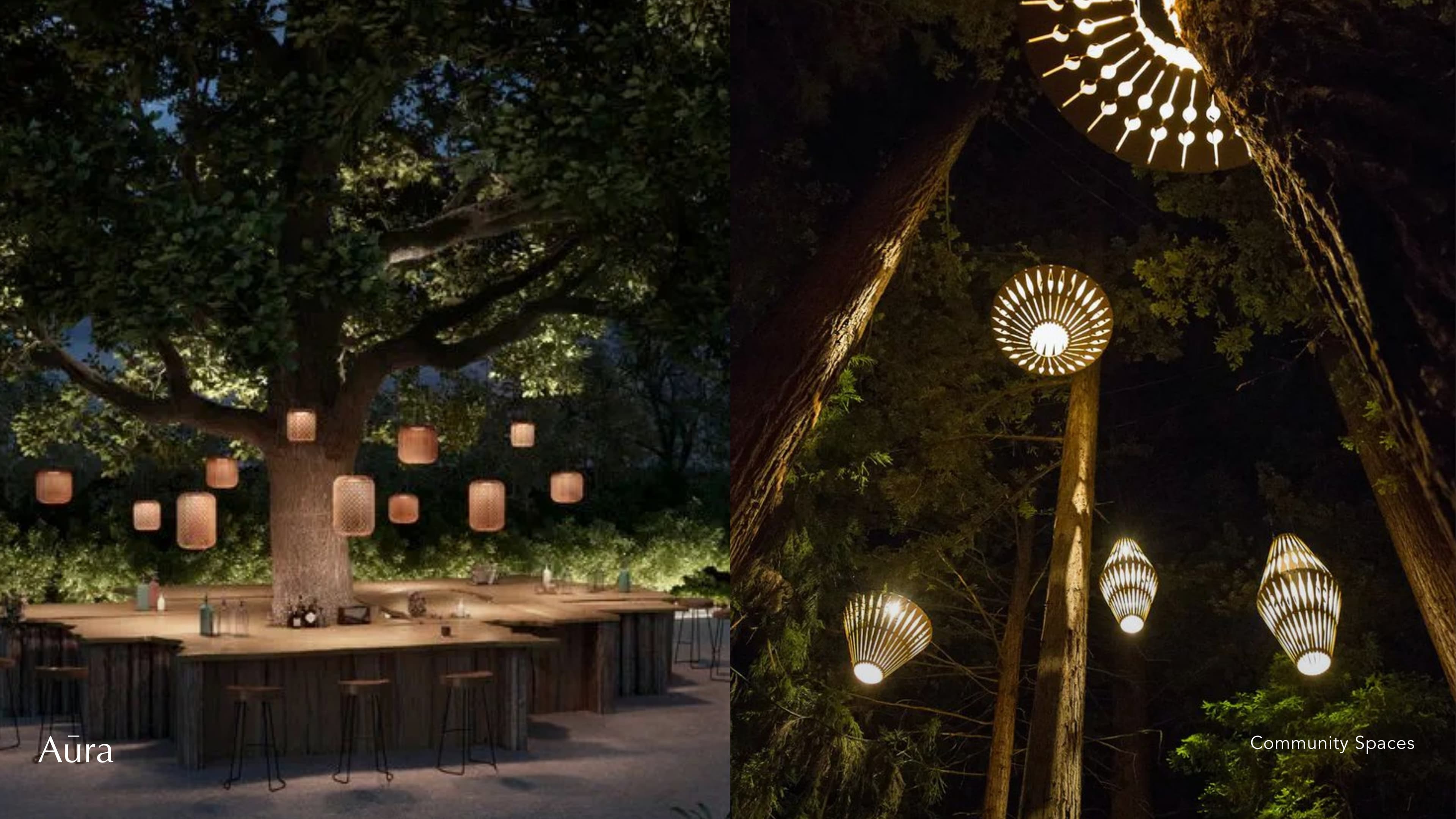
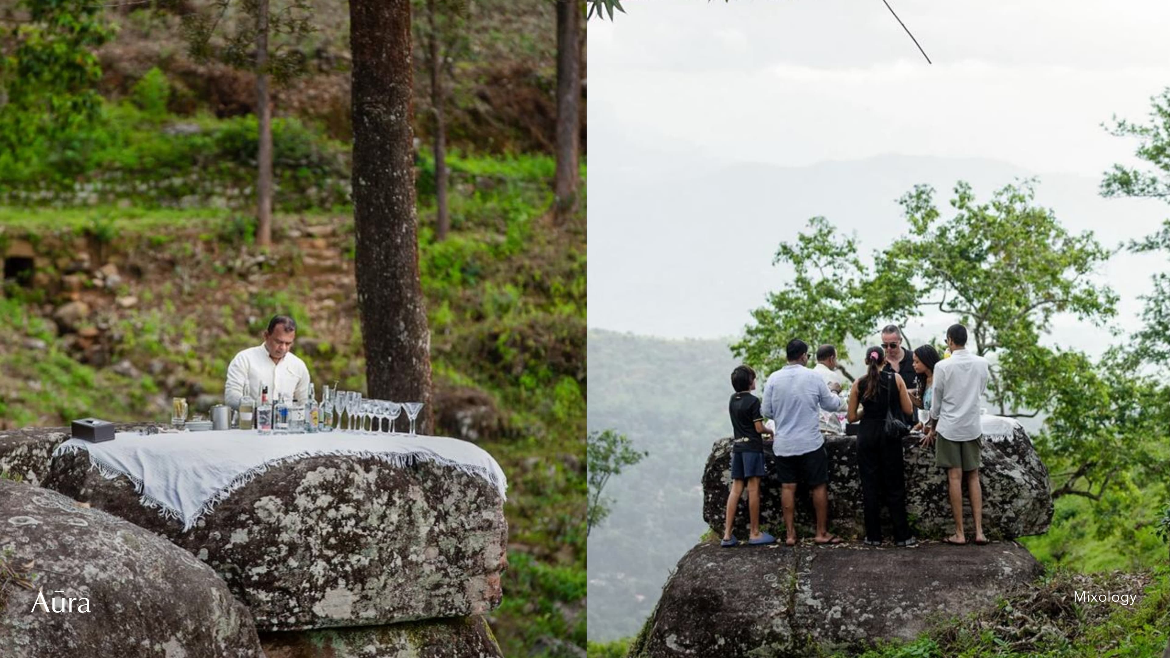
Three Pillars
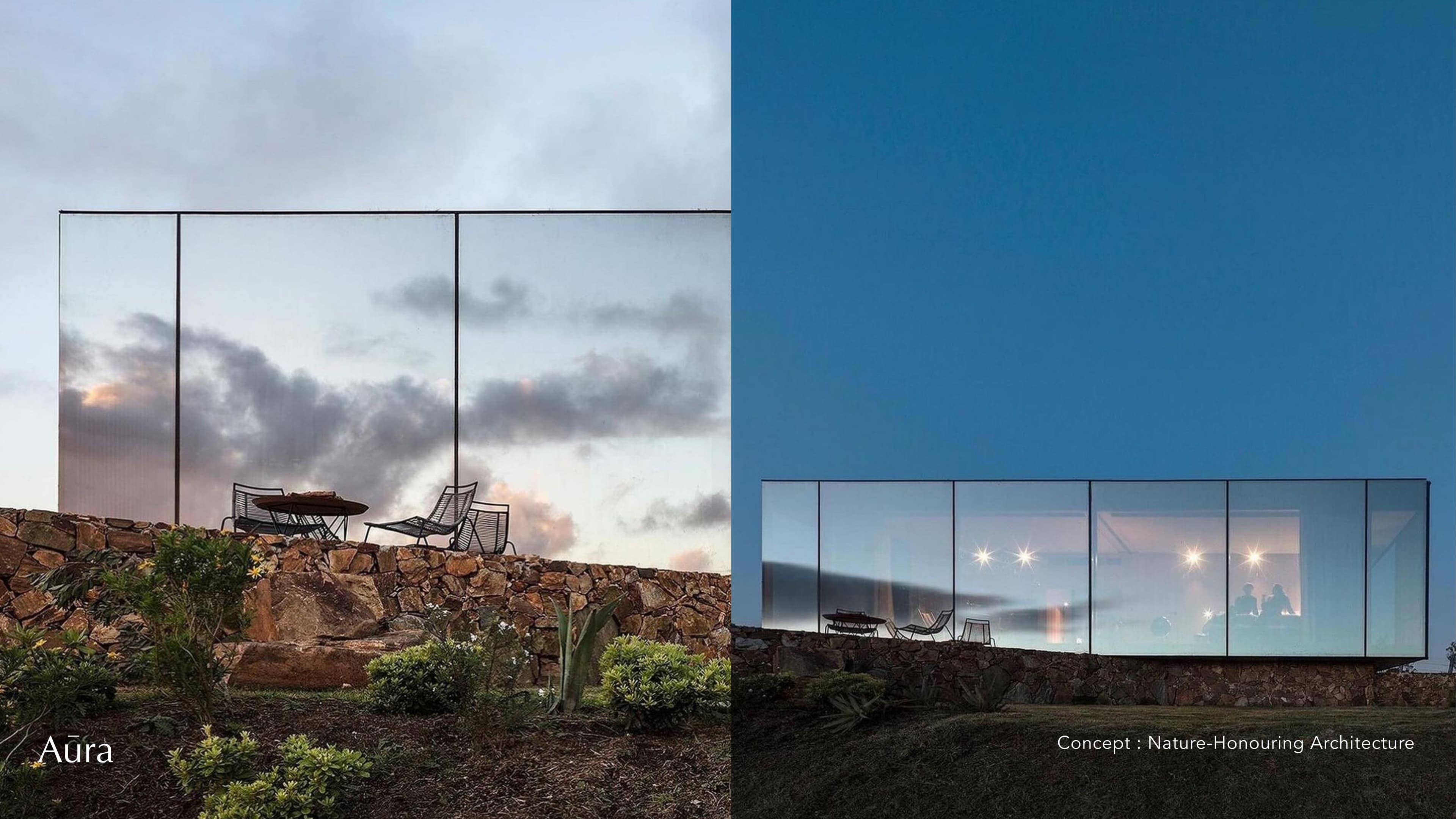
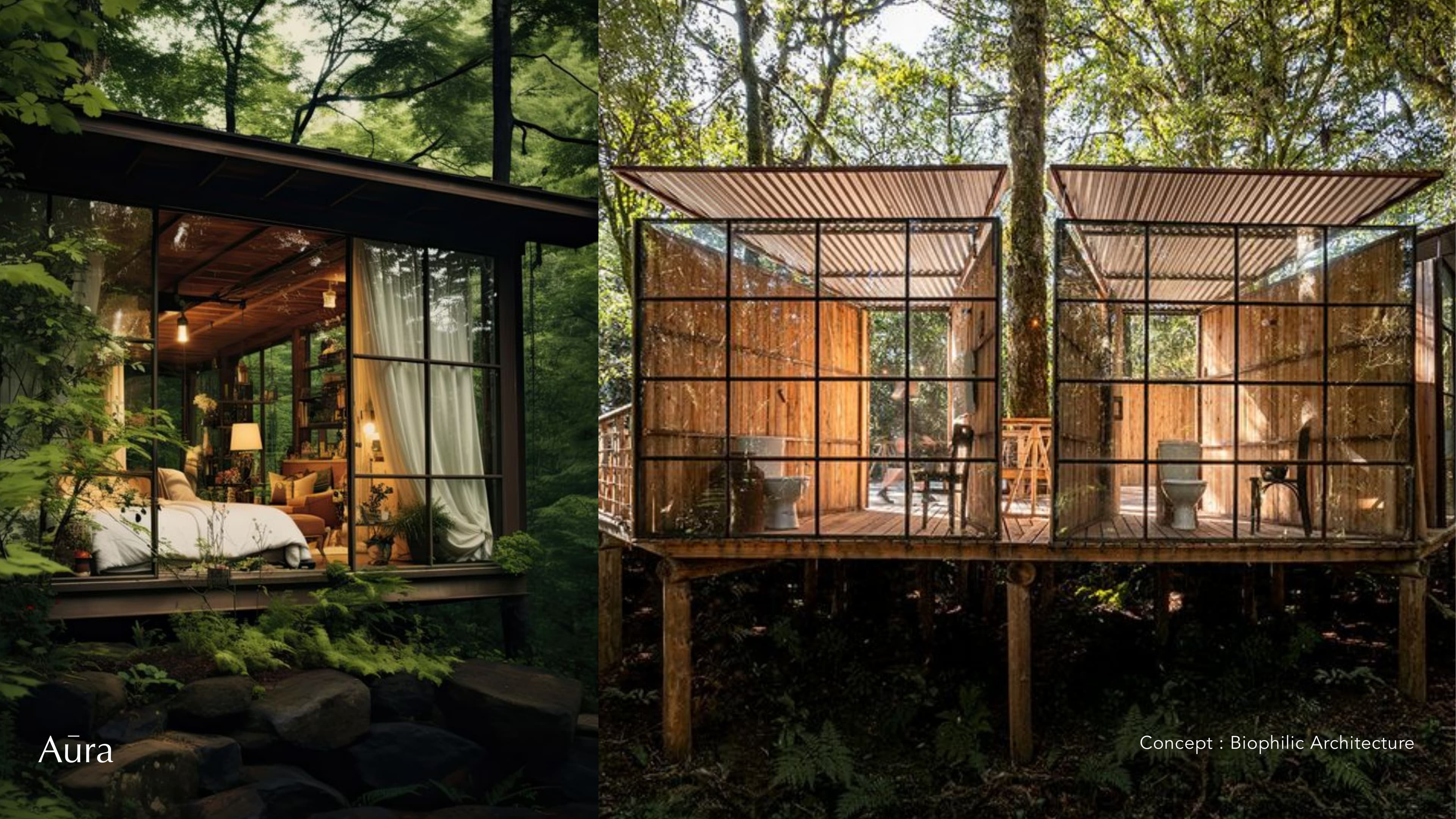
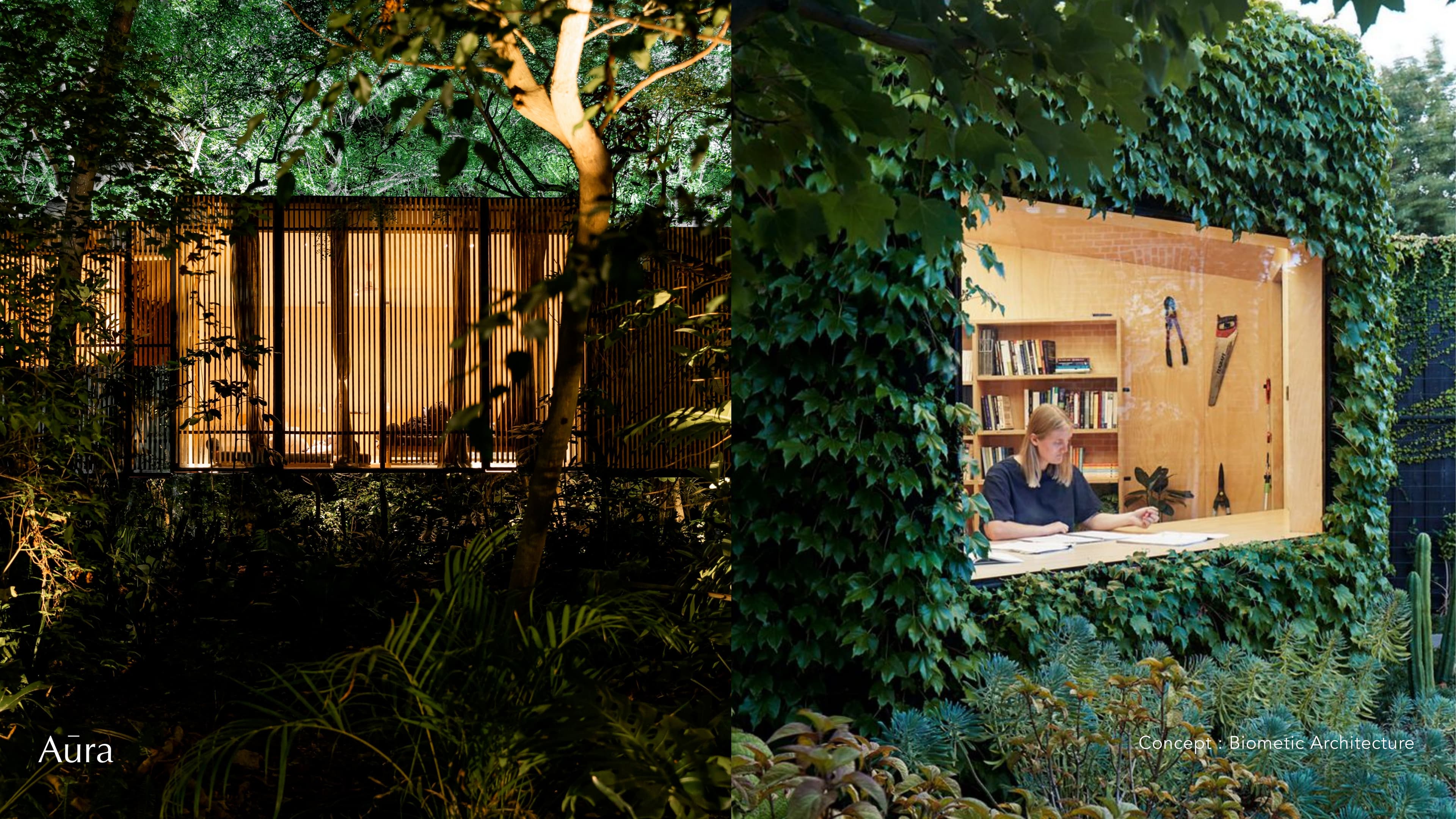
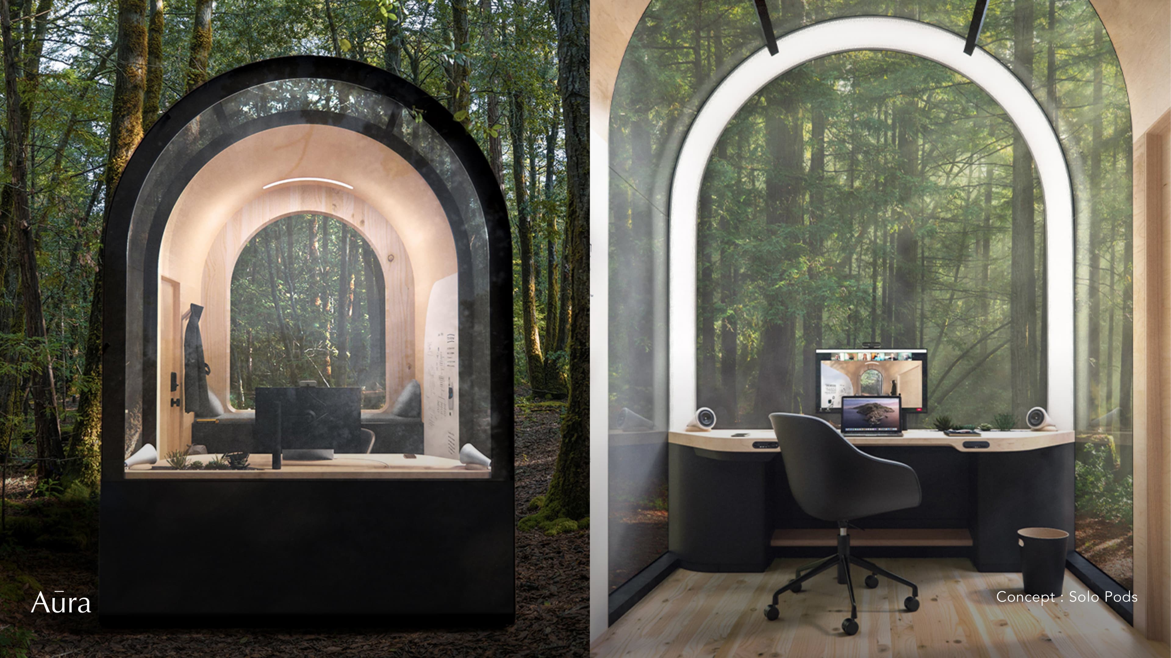
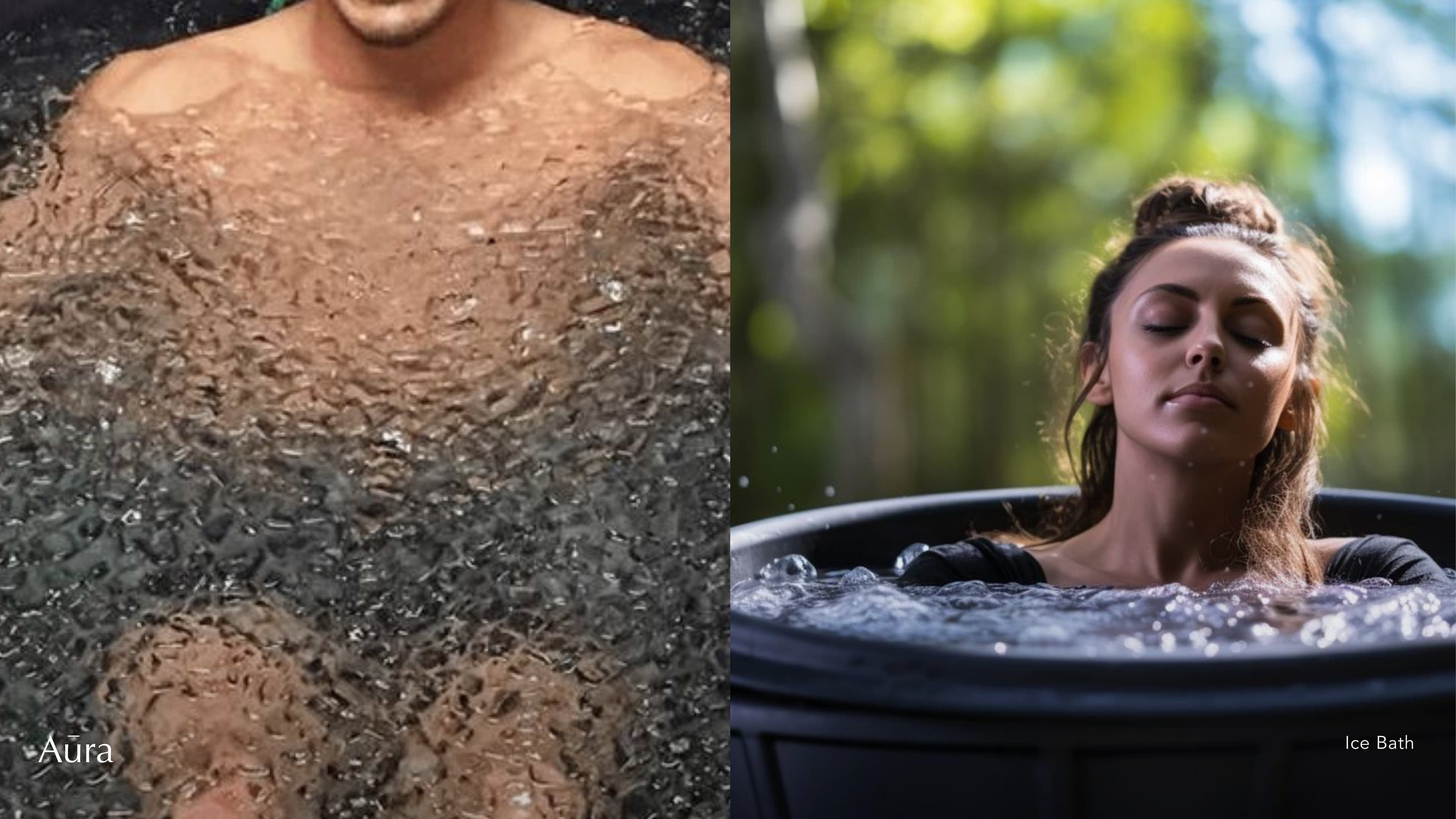
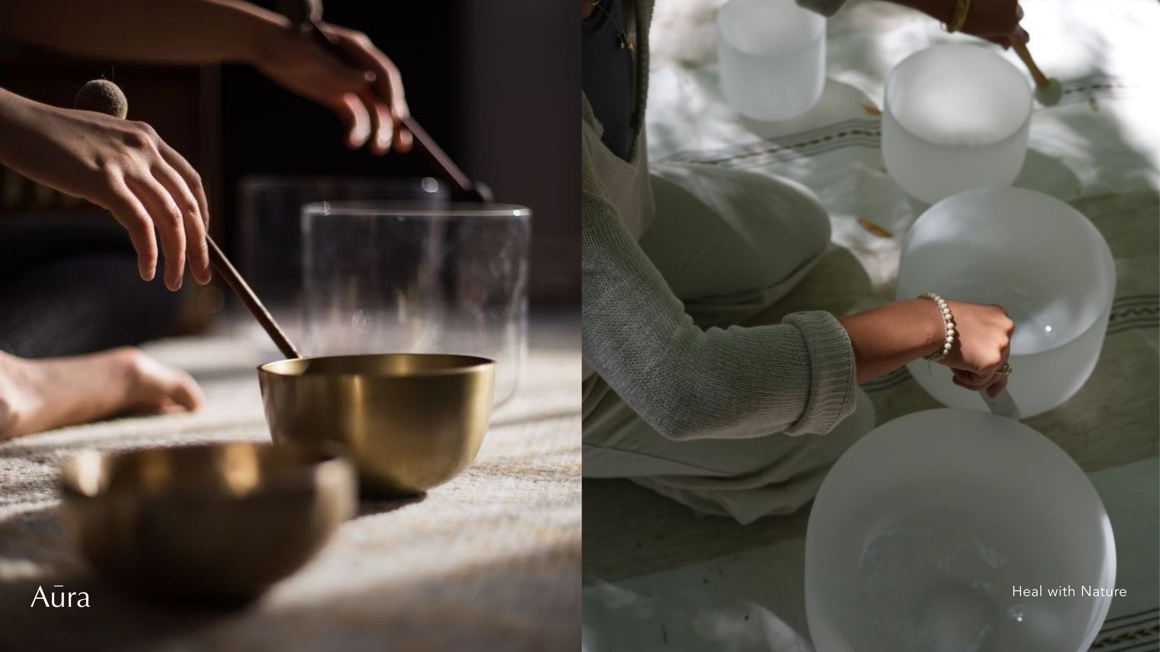
- Sanctuary — Silence, stillness, Japanese garden, forest walks
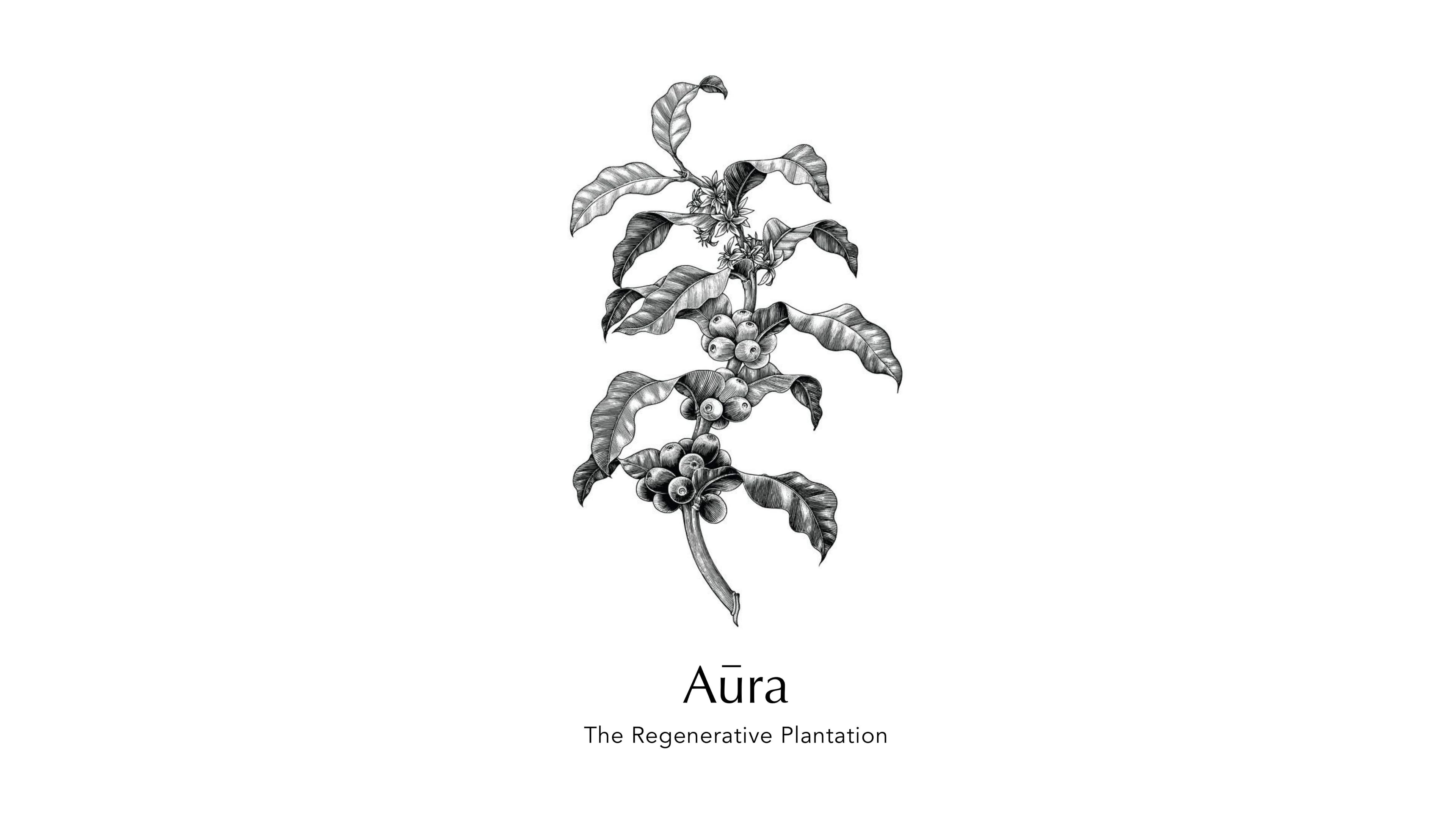
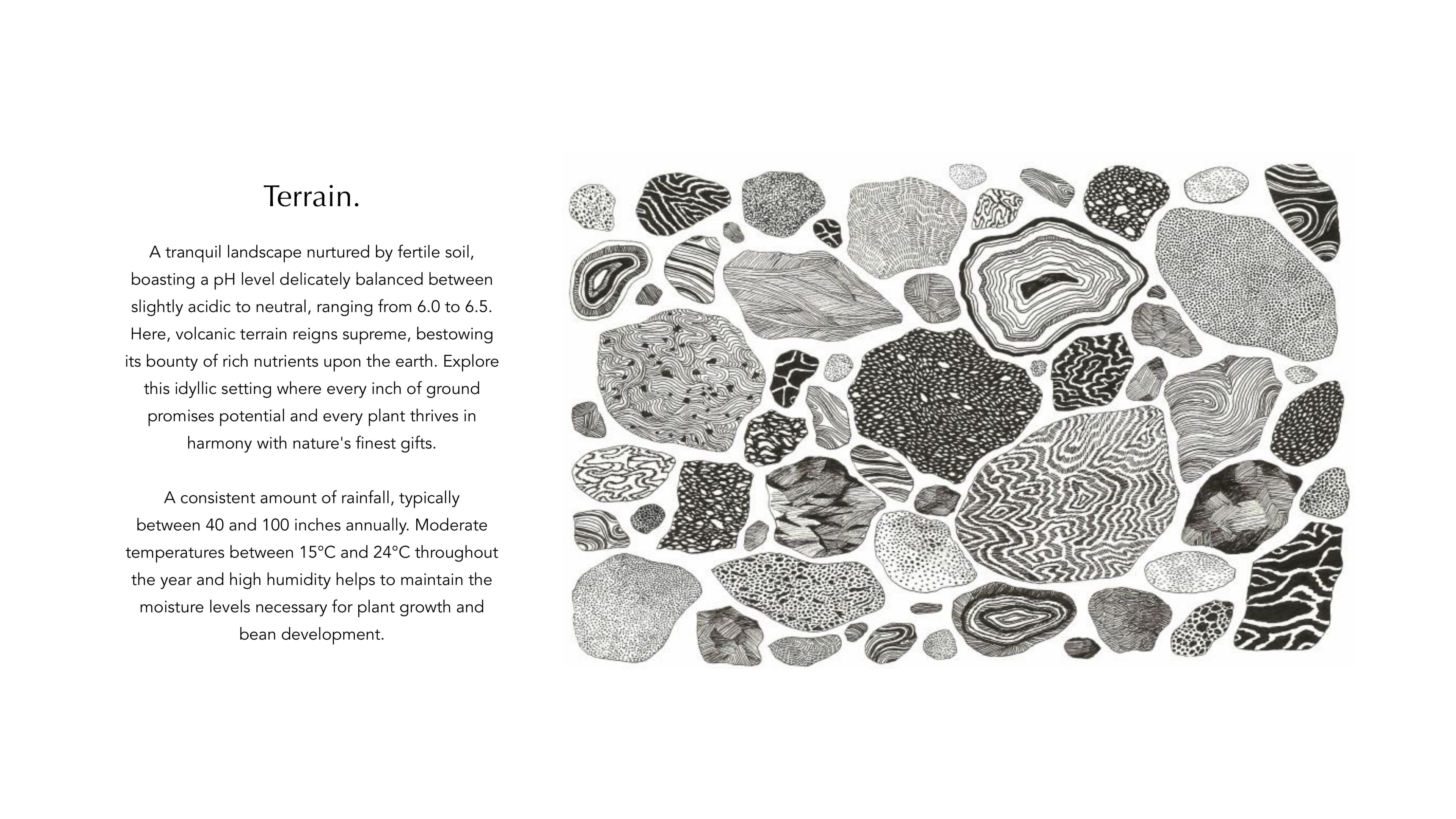
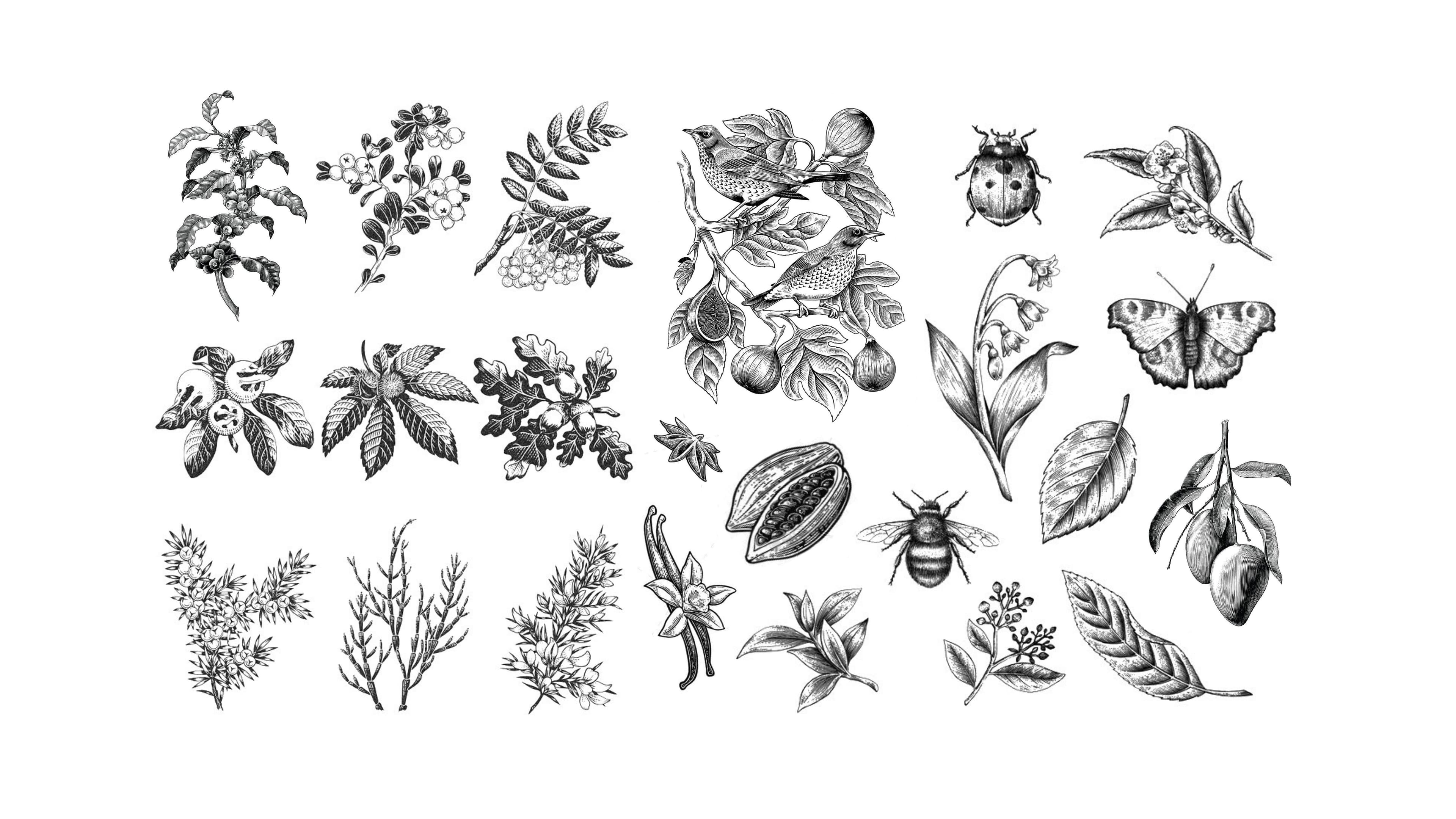
- Agroculture — 100 acres coffee, 43 indigenous cattle, native canopy
- Artistry — Studios, workshops, gallery, festivals
Method
- Soil Comes First
- Do Small Work Properly
- No Shortcuts
- Quality Before Quantity
- Think 10 Years Ahead
- Leaders Must Be on the Field
Closing
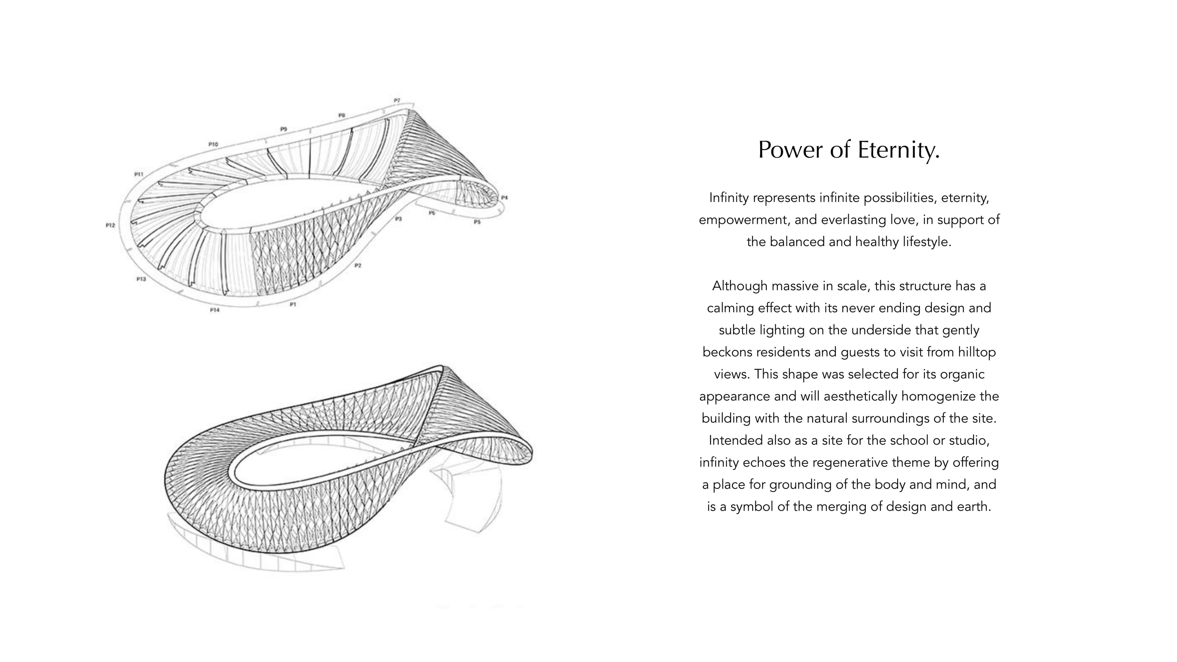
The choices made by one generation shape a thousand that follow.

Attention. Unhurried. Rooted. Awake.An intelligence shaped by people, nature, and generations of inherited wisdom.Because true progress is not measured by speed alone, but by the legacy we leave behind.Not for the next year. But for the next 1,000 years.The Aura Life is guided by Natural Intelligence.
The following pages set out the fundamentals of the Aura brand identity. It demonstrates how the brand assets work together to create a consistent and coherent brand across all touch points.
They cover both the practical aspects of how to use our design elements, and the more intangible aspects such as what Aura represents, our values and how you should express them.